ooo

ooo

color and graphic scheme for allen j. martin park, la puente, ca
client: civic art program, los angeles county arts commission

materials: paint, stencils
painting contractor: calco painting
stencils: pure black inc
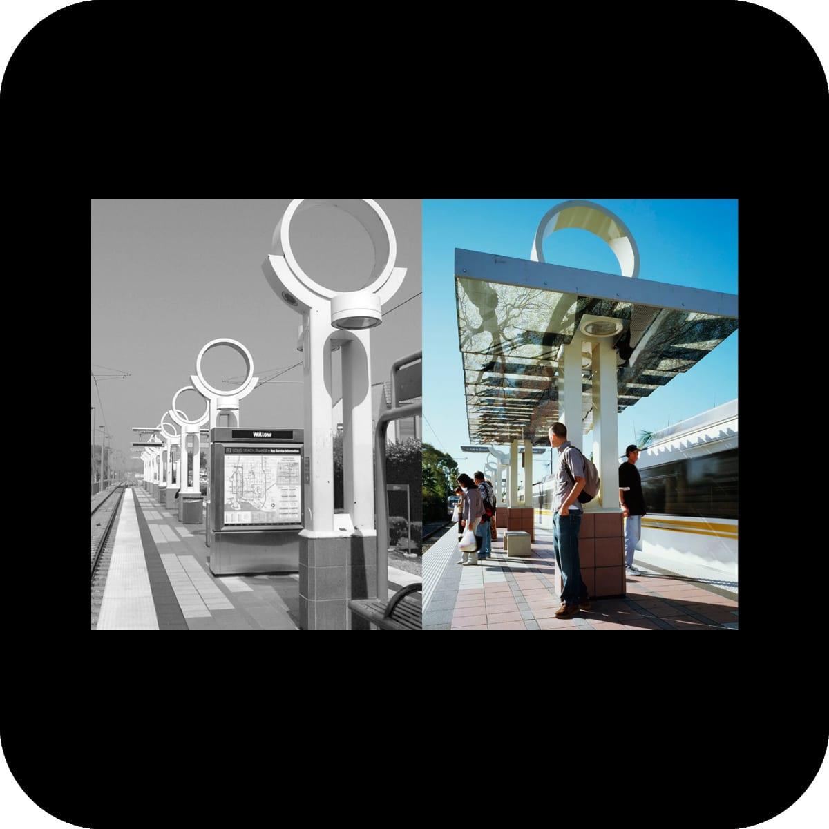
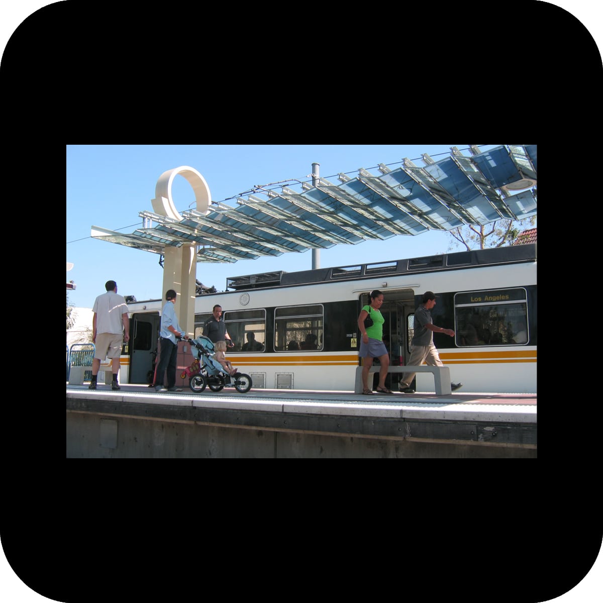
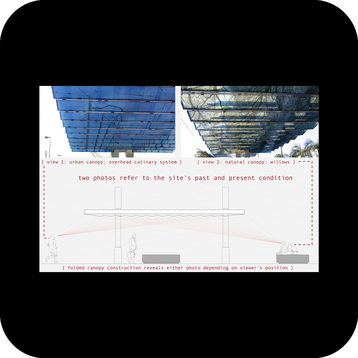
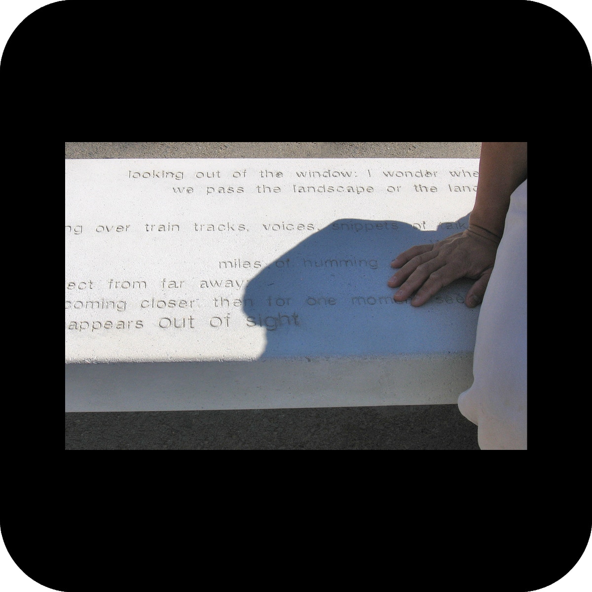
photos: merge
this project was done as part of a bigger renovation of allen martin park in los angeles county. we were asked to create a simple color concept. our goal was to create a unique identity for this site that reflects its recreational use while involving the community into the process.

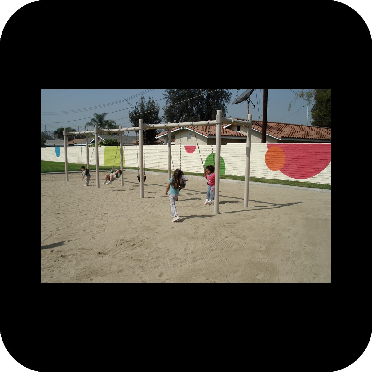
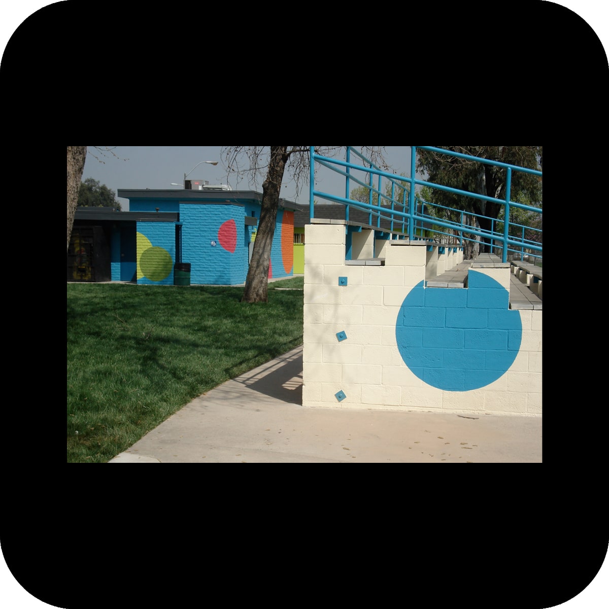
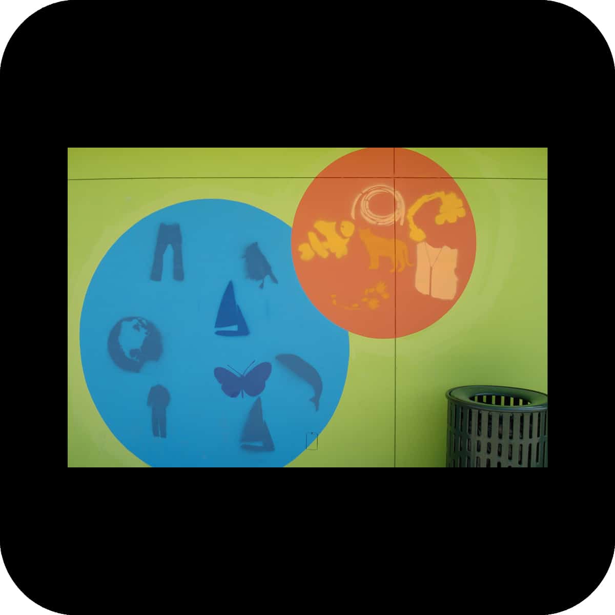
circles form the main motif of our application. the circle conveys a strong meaning beyond cultural barriers – it represents wholeness and unity, and is generally a symbol of life. on a different level circles can evoke playfulness through associations like balloons, bubbles or balls.

background application / canvas:
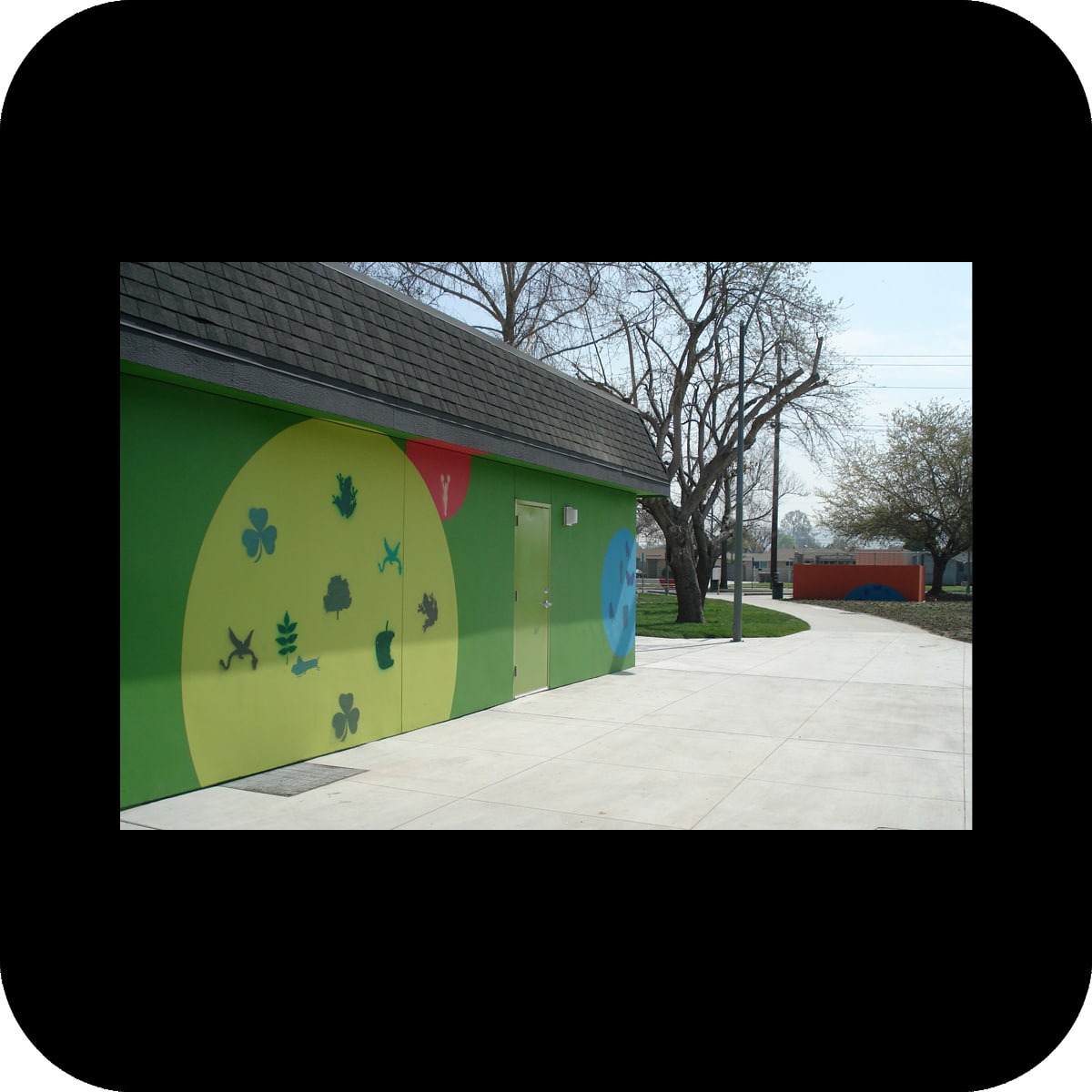
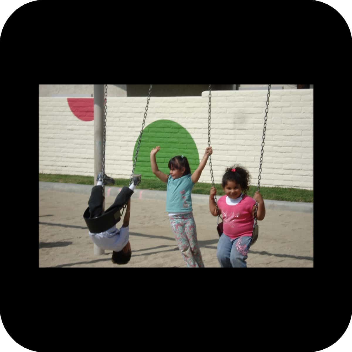
a random and simple pattern of circles was applied in a variety of densities throughout the park, unifying a number of different elements of architecture and landscape. The circles were painted in bright colors (orange, pink, blue and two greens) that visually interact with each other. the community embraced our effort introducing strong colors to the site, which was formerly characterized by beige and brown hues.

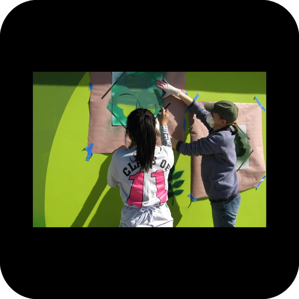
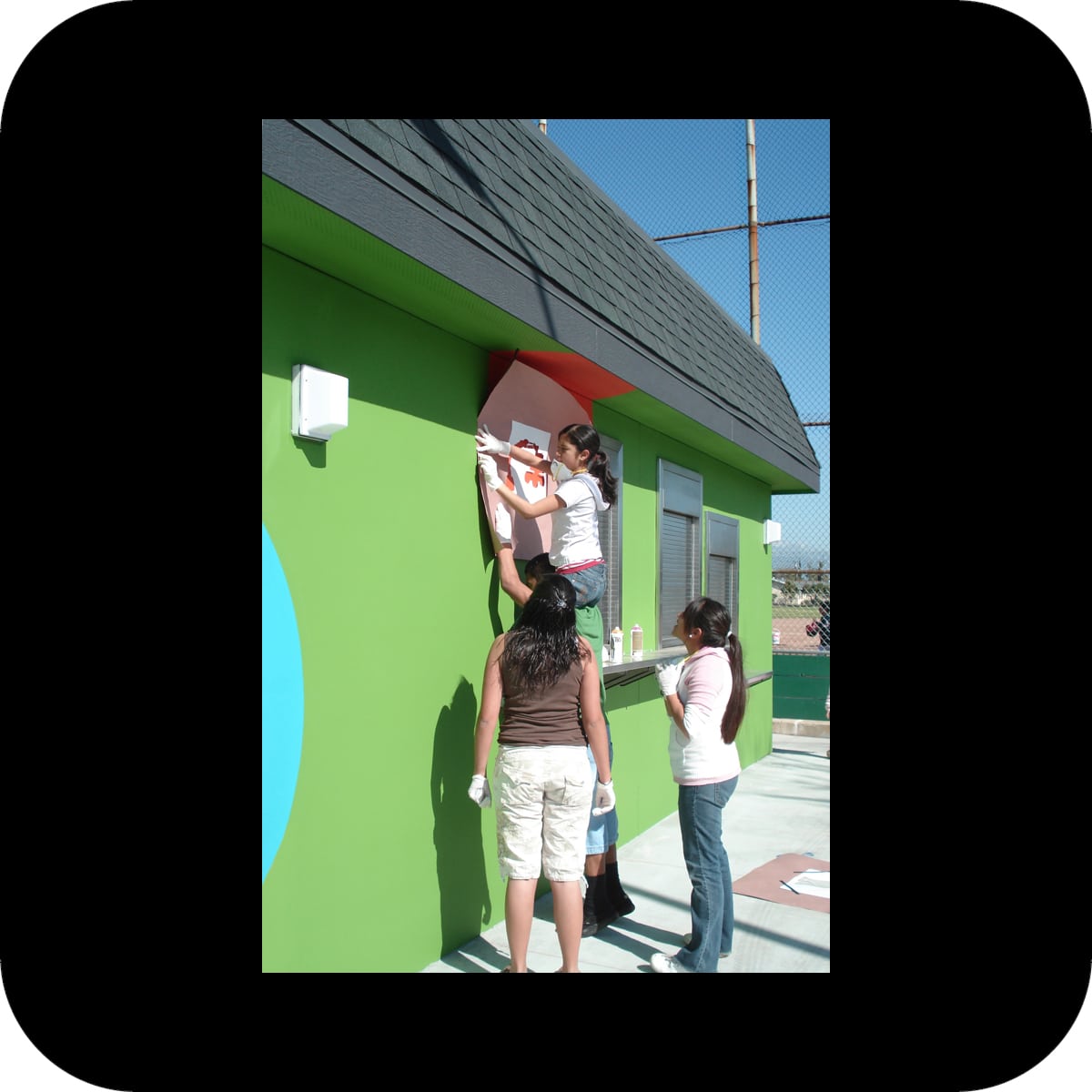
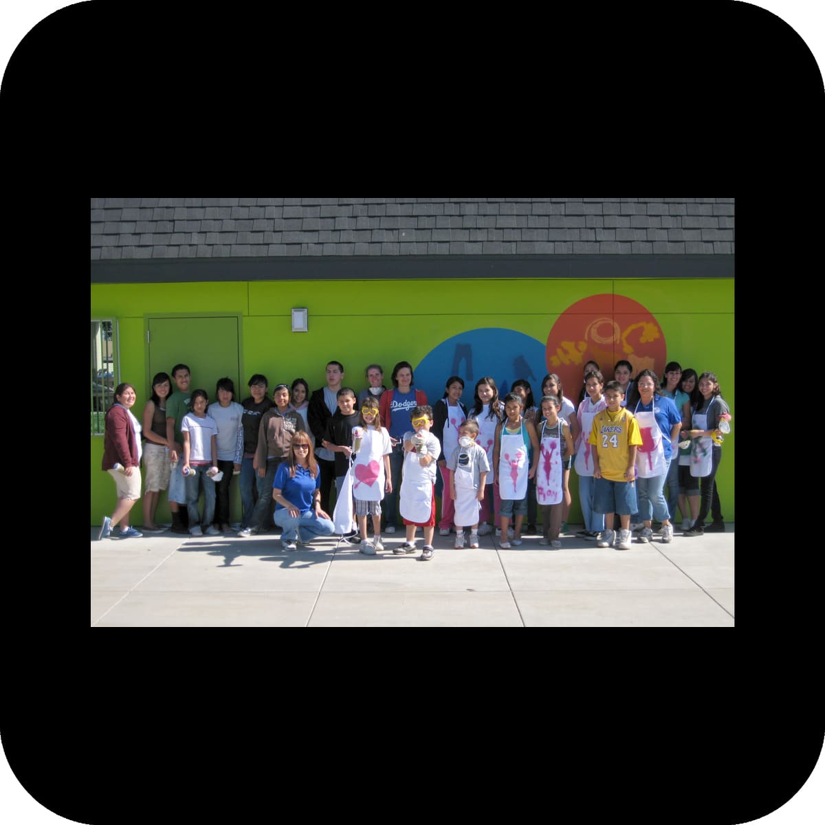
community participation:
after the base layout of the circles was applied we invited the community to attend a workshop about colors: we explored the history, meaning and symbolism of specific colors. we consequently produced stencils that represented objects associated with a specific color (i.e. a basketball for the color orange). on the following “color day” the community was invited to use the provided stencils to paint with various shades and tints of the appropriate color on any circle that matched their color. by receiving information combined with hands-on work with colors participants acquired a deeper understanding and appreciation for colors and art. the participation project was fun and educational for both us and the public, and increased the community’s identification with the site.

the project has significantly reduced the graffiti problem at the park. smaller circular stencils are being used by the park staff for continuous graffiti management when necessary. the circular pattern thus intensifies over time.

the success of this project has inspired la county to include artists in many more of their facilities renovation projects.

out of sight

out of sight

shade canopy and seating for a light rail station, metro blue line, willow station, long beach, ca
client: los angeles county metropolitan transportation authority

materials: glass w/ photographic interlayer, steel, concrete w/ relief
size: 9’x30’x1’
structural engineer: brad w. smith
steel contractor: paragon steel
glass contractor: arch aluminum and glass
concrete contractor: quickcrete
willow photograph: alexandr bravo
photos: courtesy of metro © 2006 lacmta, merge
willow station is a busy light rail station along the metro blue line, which links the areas of los angeles and long beach. the premise for this project was the need for platform seating elements as well as a shade structure. the canopy structure utilizes existing pillars for support.

the focus of our artwork is a passenger’s experience when looking out of a train car: watching the passing landscape, a traveler can observe an object from far away, slowly coming close, then for a moment see it almost as a still, frontal image before it disappears out of sight. the memory of a moment can stay in the mind of the observer, almost like a photograph, but the actual image has passed.

in our design we are working with the quality of fleeting images, similar to one’s experience in travel. two photographic images appear on a folded canopy construction. through the special structure of the canopy only one fragmented image can be seen from either platform direction as it is approached. upon approaching there is one moment when one image becomes perfectly aligned and perceivable. upon passing this view point the second image comes into view and fragments the first image. from underneath the canopy both images are equally in view, breaking each other into stripes. the viewer standing right under the canopy also perceives a stretch distortion to the images.

the choice of images is a play on the present and past conditions encountered at the site: the “urban canopy” of the train cables as opposed to the “natural canopy” of the willow trees that once grew right there.

in addition to the canopy, two precast-concrete benches were installed. the benches are inscribed with text fragments which cue the user to the thought process behind the canopy: posing questions about one’s experience of travel and relating to the history of the site.

passersby

passersby

permanent public art installation at a mixed-use building at lake avenue, pasadena, ca
client: the hanover company, commissioned for the pasadena public art program

materials: glass w/ photographic interlayer, concrete stain
art consultant: beatrix barker & associates
glass fabricator: cesar color
photos: merge

our installation utilizes four architectural steel/glass canopies that mark the primary entrances and spread out along the facade of the building. we transformed these architectural elements into a light-box construction that illuminates a continuous glowing band of photographs.

images of different people who responded to a public call for participants cover the bottom side of the glass canopies. the photographs show people walking and standing, as seen from above, and vary in scale according to the different installation height of each canopy.

we continued this topic with a corresponding element embedded in the side walk beneath the canopies: we constructed the “shadow” of each depicted “passerby”, as if each person that is shown on the canopies above was standing in exactly this position on the sidewalk right underneath it. the resulting fake “shadows” are traced and permanently captured by embedding the shadow shapes in the sidewalk using concrete stain and cutting shadow outlines into the concrete.

together the photographs and the shadows of these “passersby” created a hypothetical urban population, as might be found on such a busy intersection as lake avenue and green street.

overcoat

overcoat

color concept and tile artwork for usc medical center (t47) and california state university los angeles (t48) bus-way stations, los angeles, ca
client: los angeles county metropolitan transportation authority

materials: paint, ceramic tile
tile fabrication: heath ceramics
tile meshing: precision h2o
photos: courtesy of Metro © 2006 LACMTA, merge
the challenge at both bus-way stations was to convert unappealing, utilitarian structures next to a freeway into more attractive environments through new color schemes and tile applications.

at the usc medical center’s bus-way station, the choice of two green and three blue tints counteracts the gray color palette of the immediate surroundings (the interstate 10 freeway and the adjacent railway). the 1970s’ station with a stern atmosphere became transformed into a playful array of color spaces.

the tile application in the station repeats the colors of the paint scheme and forms mosaics of several graphic icons. the icon subjects were derived from the surrounding area of the station as well as the destinations of the bus lines.

at the second bus-way station at cal state la, tints of reds were used to brighten up the station. the basis of the paint scheme for this station was the observation of an ever occurring problem at the site: graffiti. instead of trying to paint over graffiti with a color that is supposed to (but never really does) match the under-laying color, the maintenance staff was provided with rectangular stencils to paint over the graffiti with four distinct red tints. this process of over-coating will create an intentional, random pattern over time that directly reacts to the urban phenomenon of graffiti. it makes the dynamic of tagging and over-coating part of the artwork. additionally, tile applications in two areas of this station work graphically with a similar color palette and rectilinear patterns.

outside in

outside in

temporary public art installation at clover park, santa monica, ca
client: city of santa monica, commissioned as part of fresh art

materials: plywood, steel frames, photographic wallpaper
size: 5 houses, ±3’x4’x4’
art consultant: marc pally
fabrication: by artists
photos: merge
houses are the base units of our city. it is in our houses that we create our own miniature cosmos to define our place in the world. choosing to live close to each other we search for community, with each step moving further away from nature. but what happens to our longing for nature and open space in the urban environment?

a park is one way to substitute a nature experience in a city. on the other hand, our homes often contain decorative elements to reconnect us to nature. the highly idealized images in photographic wallpapers bring this experience into our living rooms. oral traditions such as songs, texts, and rhymes provide yet another way to connect us to nature.

in this installation we connected these manifestations of humanity’s desire for nature. we created five abstracted, identical house shapes and inhabited them with nature references. the inside of each house was wallpapered by one nature motif. regional legends, poems or songs on the plywood exterior of each house referred to the nature’s environment created inside the house.

the houses were installed in park areas adjacent to the playground. thus they became usable objects to touch and play with, dimensioned to fit children’s bodies.