8 minutes

8 minutes

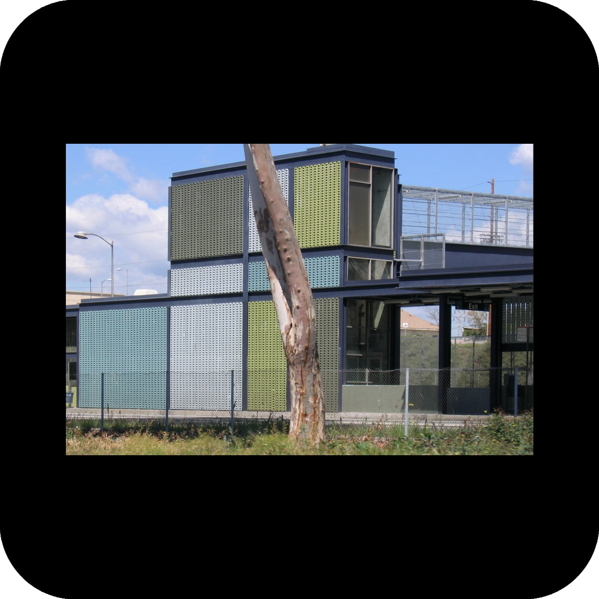
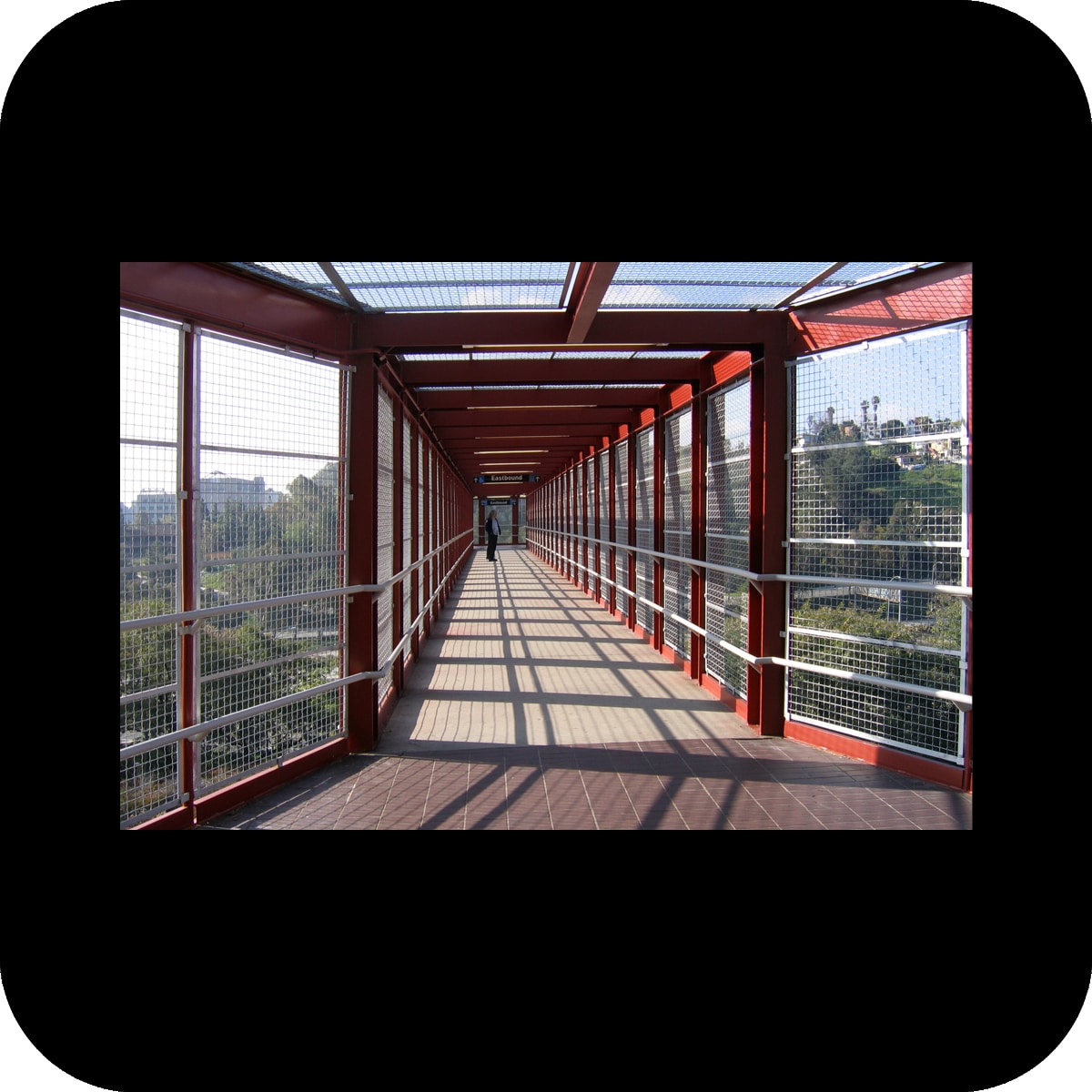
permanent public art installation for fire station 24, san jose, ca
client: city of san jose public art program

materials: led sign, ceramic tile w/ glazed-on photographs
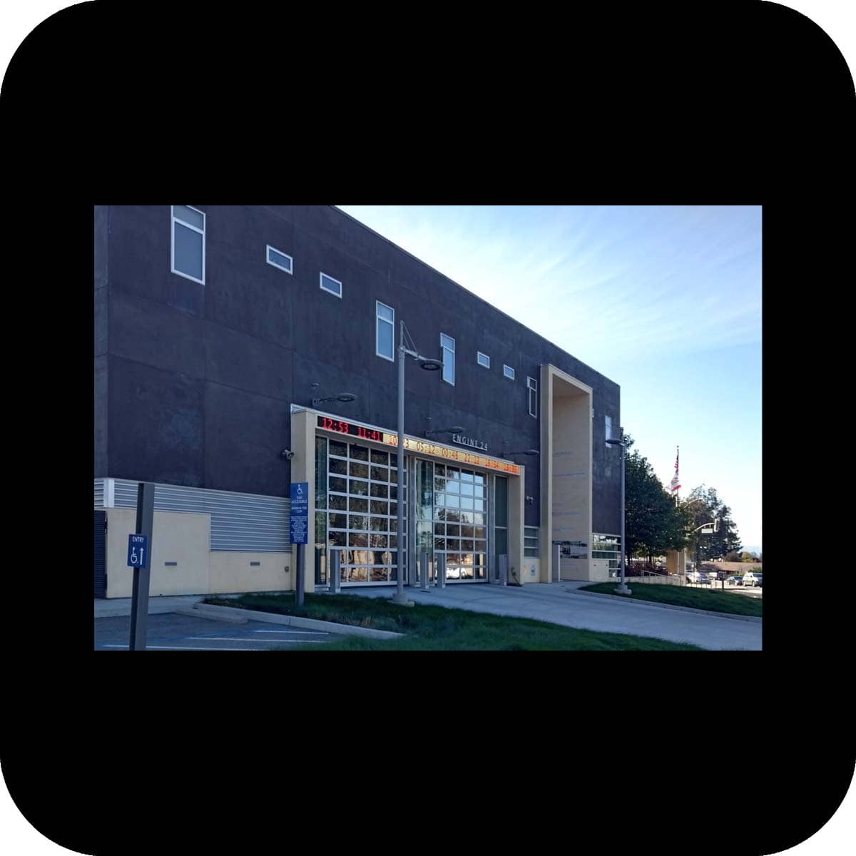
size: led sign 40’x15”, 2 facades w/ tiles ±22’x30’
led sign fabricator: yesco
tile fabricator: tile artisans
photos: merge
our design consists of two parts – a call time archive and photographs & text snippets that explore the topic of the “emergency standard response time” – a time frame of eight minutes within which firefighters at this fire station have to arrive at any given emergency.

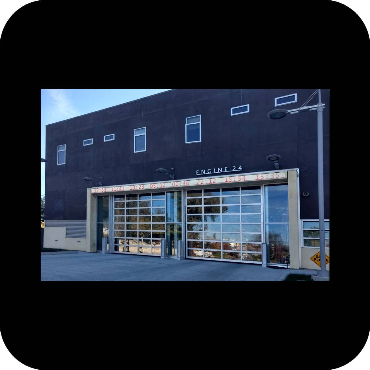
a led sign, connected to the alarm system of the fire station, was integrated into the facade above the fire engine bay. the led sign displays the last eight times the firefighters went on a call. every new emergency call activates the display – a narrow red strip moves across the display changing the background from white to yellow over an eight minute period. when the eight minute cycle is completed, the background color changes back to white, and the time of the most recent emergency is added to the display.

with the activation of the display the public is able to sense the abrupt change in speed of life at the fire station. the timeline becomes a continuously updated record of the firefighters workday, thus making their work more transparent to the public.

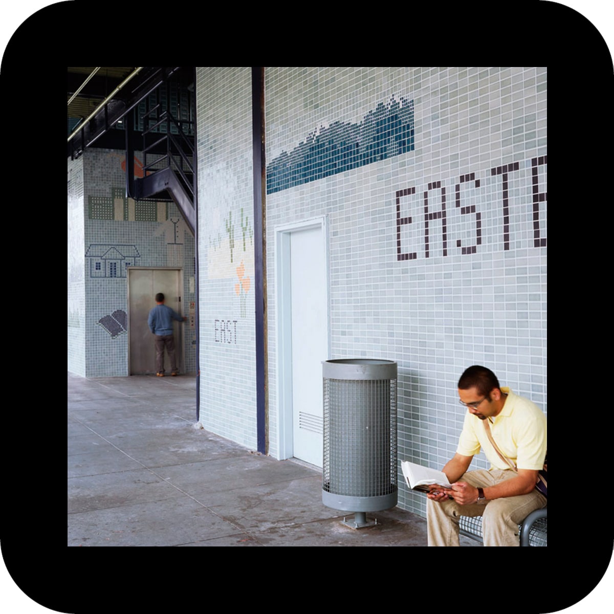
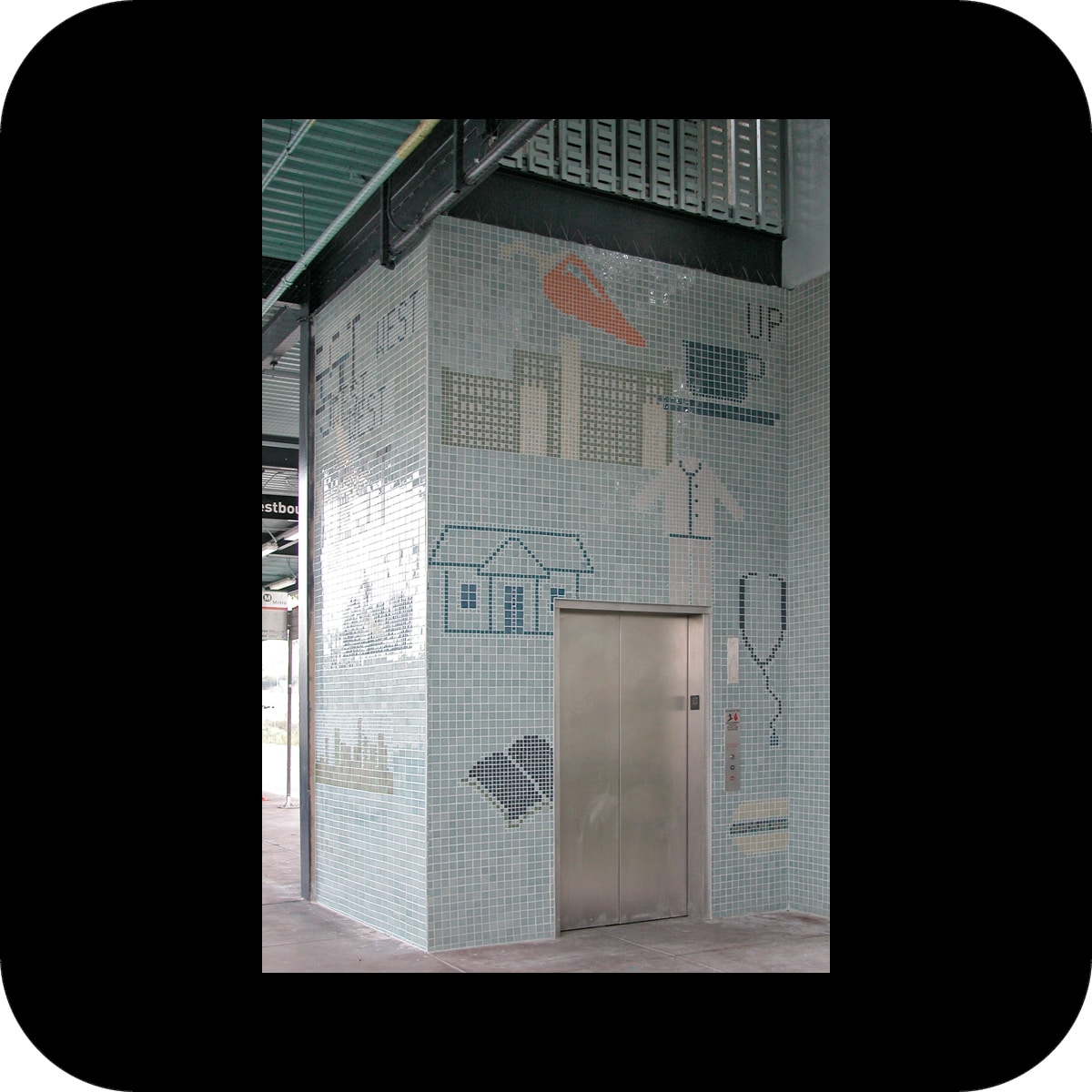
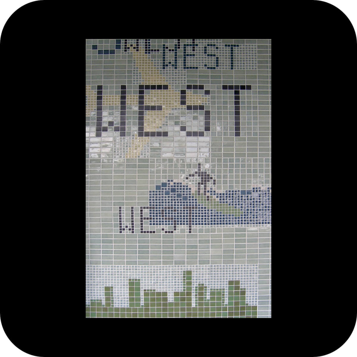
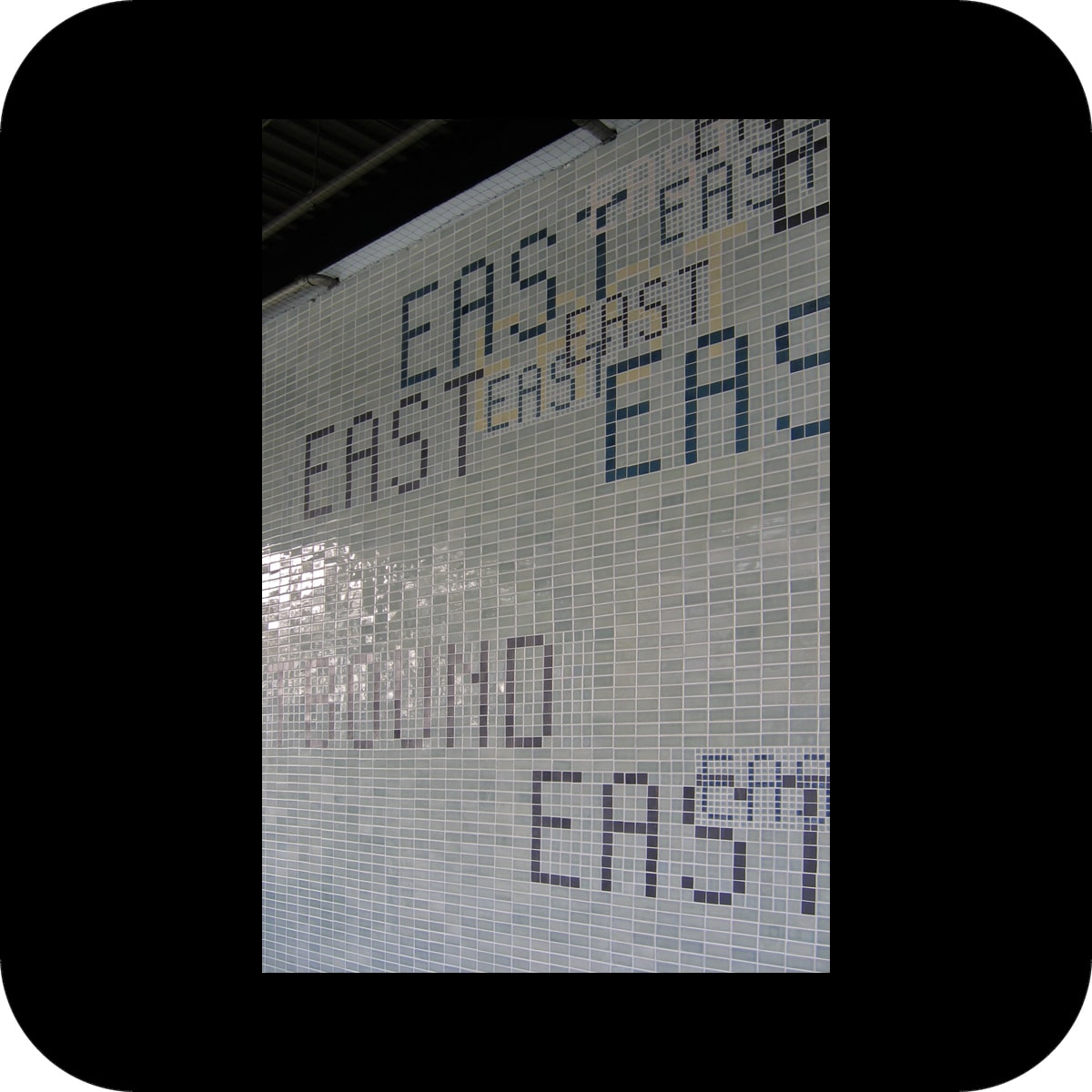
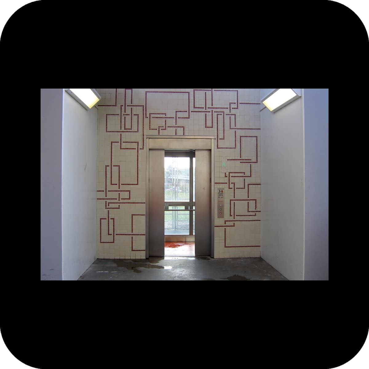
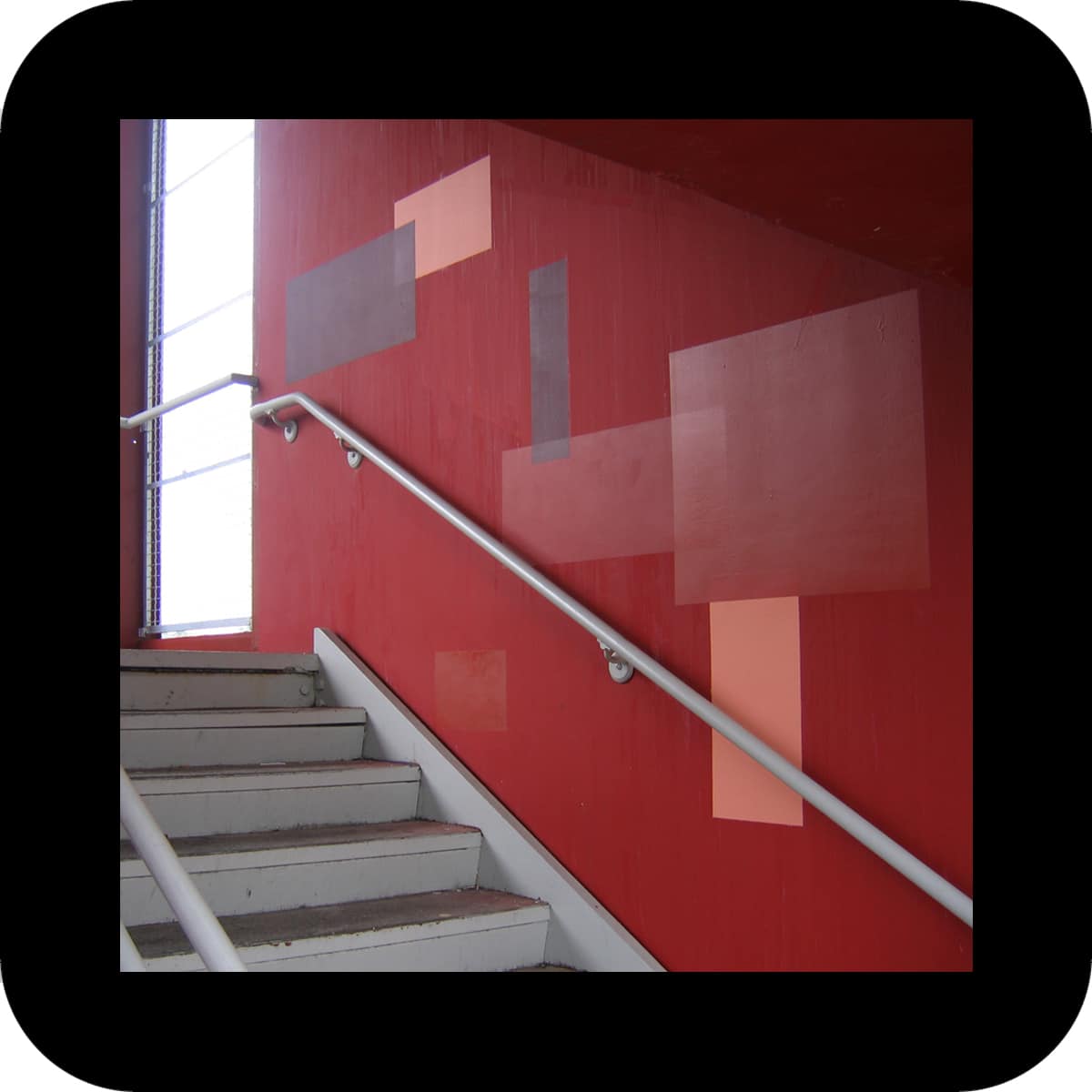
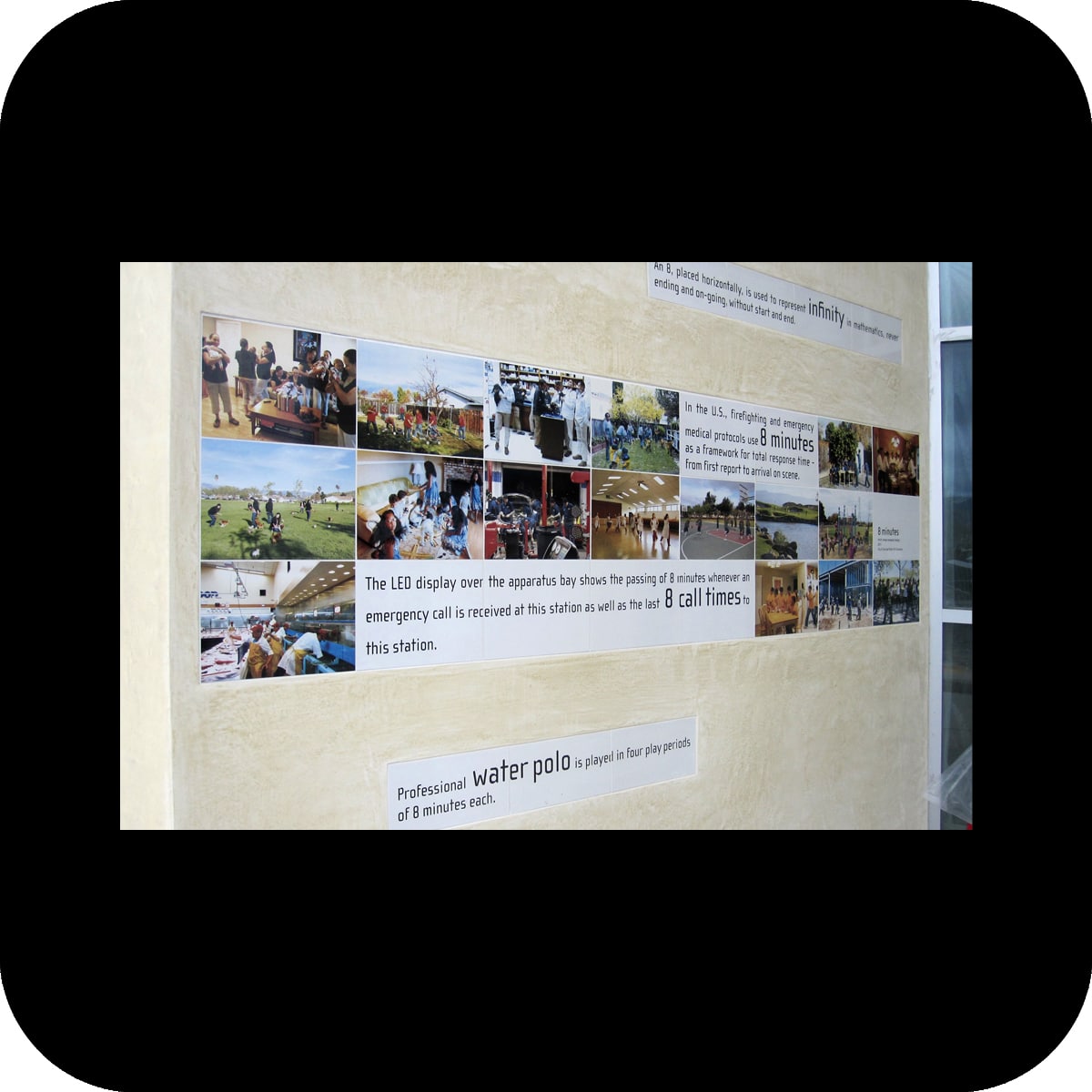
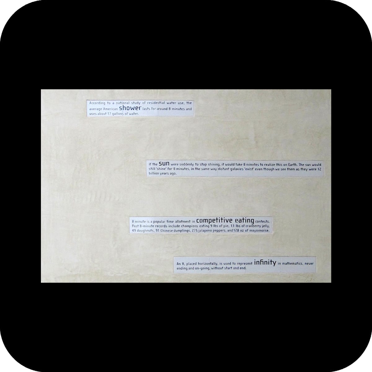
in the second part of the artwork, porcelain tiles with applied text and photographs were installed at the exterior entrance foyer of the fire station. these images and text pieces relate the notion of 8 minutes to everyday life outside the fire station.

27 text snippets describe events that typically occur over 8 minutes, some derived from science, others from popular culture or everyday experiences.

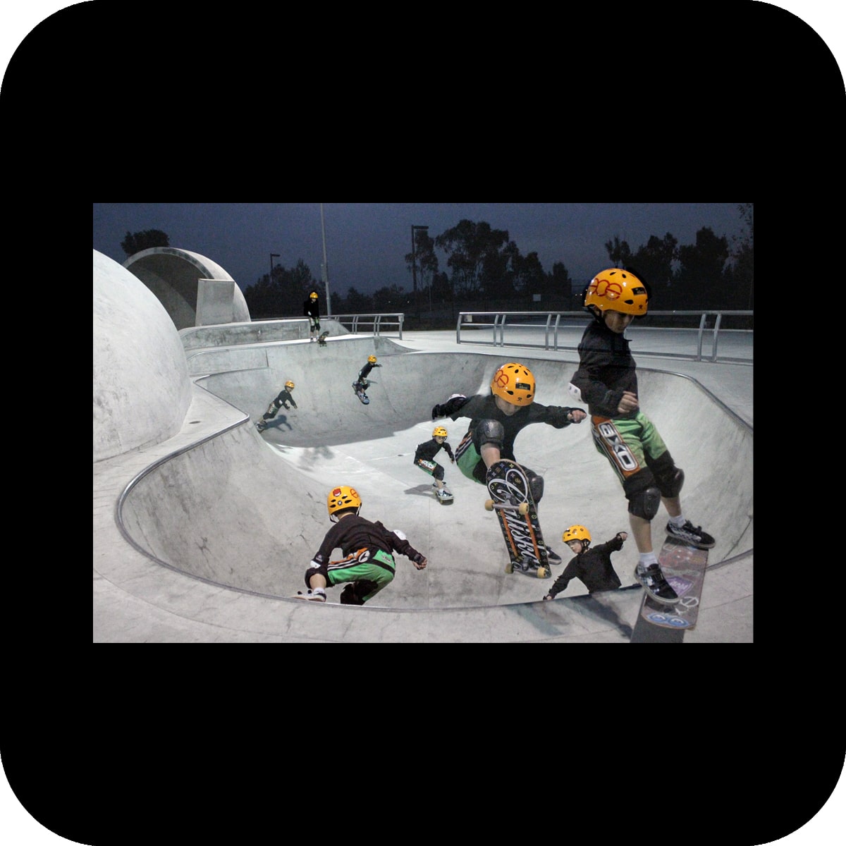
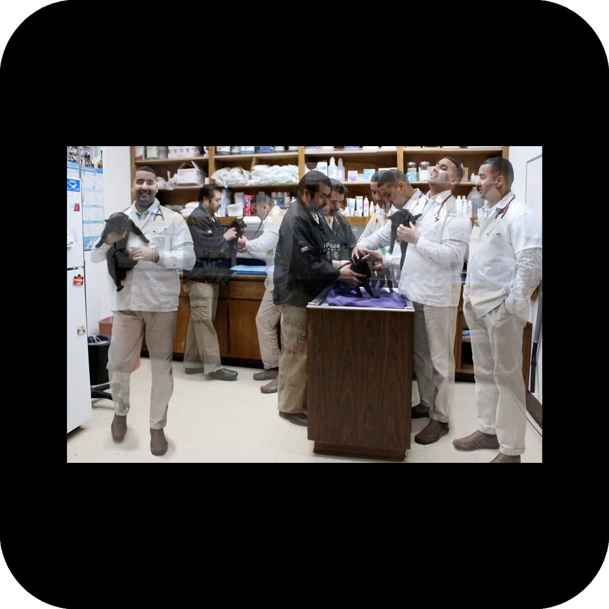
time-lapse photographs depict 8 minutes out of the everyday life of 30 local residents. each photograph is composed of 8 images taken from a fixed perspective with one exposure per minute. the background works as a still image while the person depicted follows his/her activities and appears as multiples on the image.

overcoat

overcoat

color concept and tile artwork for usc medical center (t47) and california state university los angeles (t48) bus-way stations, los angeles, ca
client: los angeles county metropolitan transportation authority

materials: paint, ceramic tile
tile fabrication: heath ceramics
tile meshing: precision h2o
photos: courtesy of Metro © 2006 LACMTA, merge
the challenge at both bus-way stations was to convert unappealing, utilitarian structures next to a freeway into more attractive environments through new color schemes and tile applications.

at the usc medical center’s bus-way station, the choice of two green and three blue tints counteracts the gray color palette of the immediate surroundings (the interstate 10 freeway and the adjacent railway). the 1970s’ station with a stern atmosphere became transformed into a playful array of color spaces.

the tile application in the station repeats the colors of the paint scheme and forms mosaics of several graphic icons. the icon subjects were derived from the surrounding area of the station as well as the destinations of the bus lines.

at the second bus-way station at cal state la, tints of reds were used to brighten up the station. the basis of the paint scheme for this station was the observation of an ever occurring problem at the site: graffiti. instead of trying to paint over graffiti with a color that is supposed to (but never really does) match the under-laying color, the maintenance staff was provided with rectangular stencils to paint over the graffiti with four distinct red tints. this process of over-coating will create an intentional, random pattern over time that directly reacts to the urban phenomenon of graffiti. it makes the dynamic of tagging and over-coating part of the artwork. additionally, tile applications in two areas of this station work graphically with a similar color palette and rectilinear patterns.