aritz ona

aritz ona

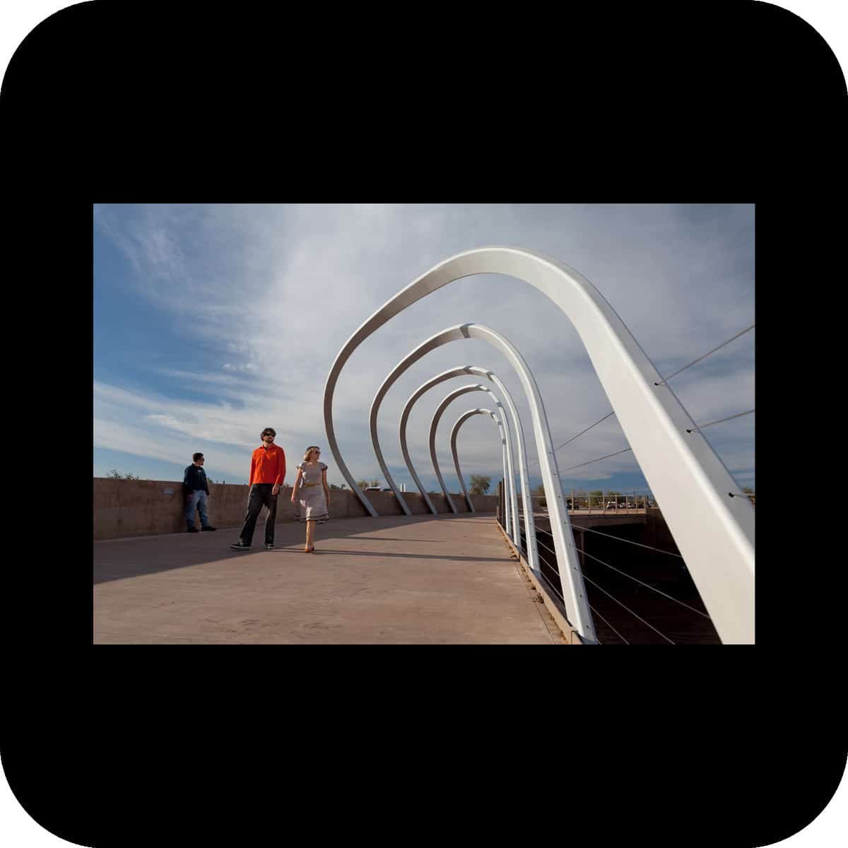
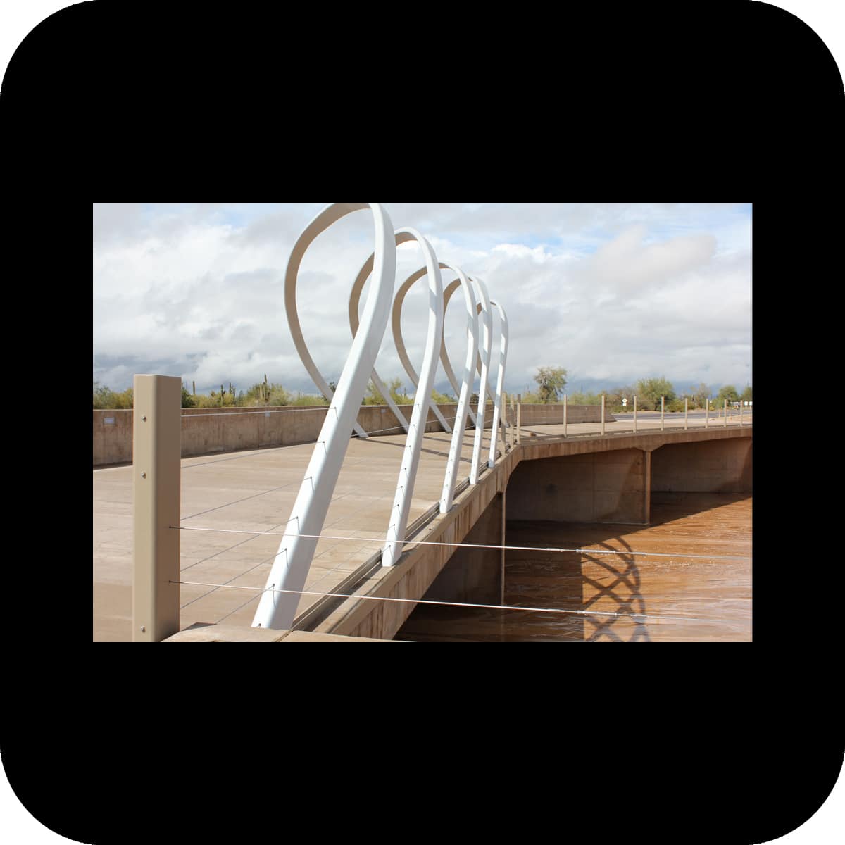
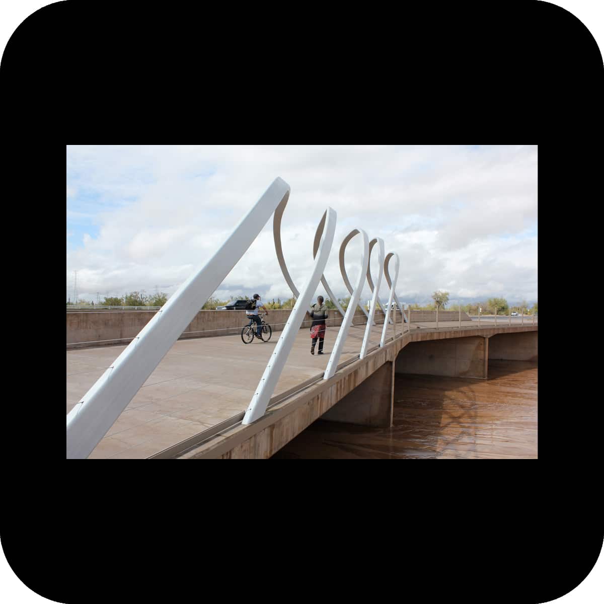
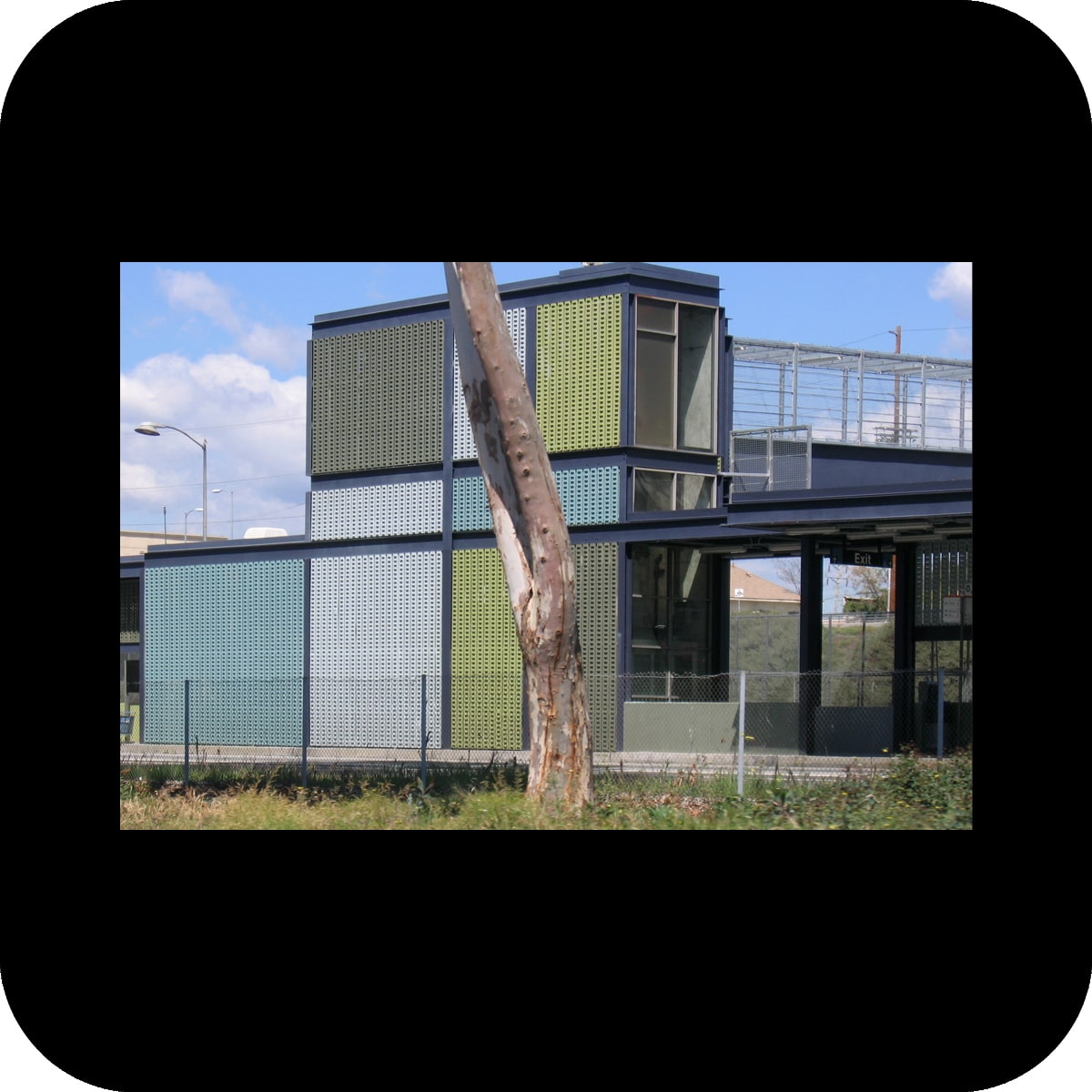
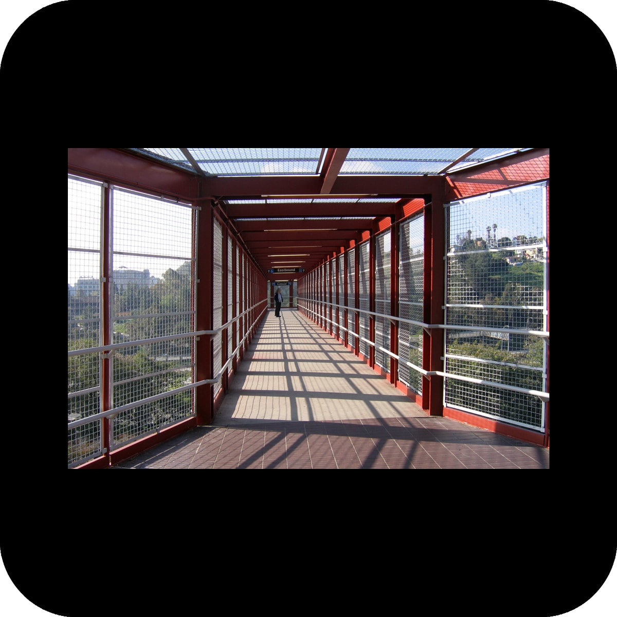
permanent installation for the glendale ave light rail station, phoenix, az
client: valley metro light rail phoenix
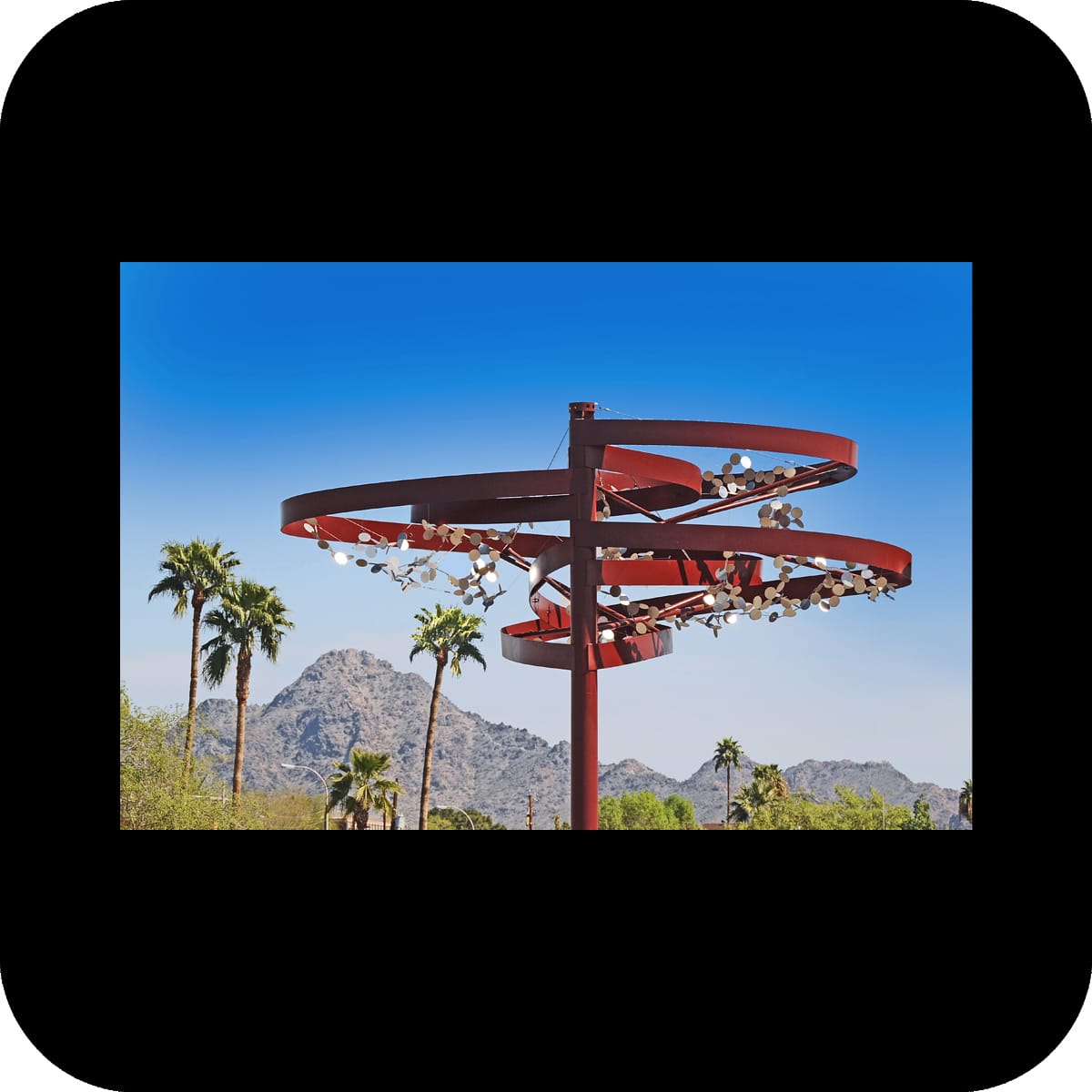
materials: painted steel, stainless steel, cable
size: five structures, ±9’x8’x14’ each
structural engineer: structural grace
metal fabricator: magnum companies
photos: merge, valley metro
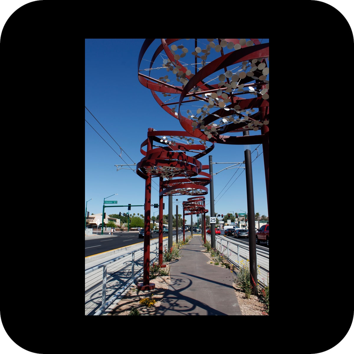
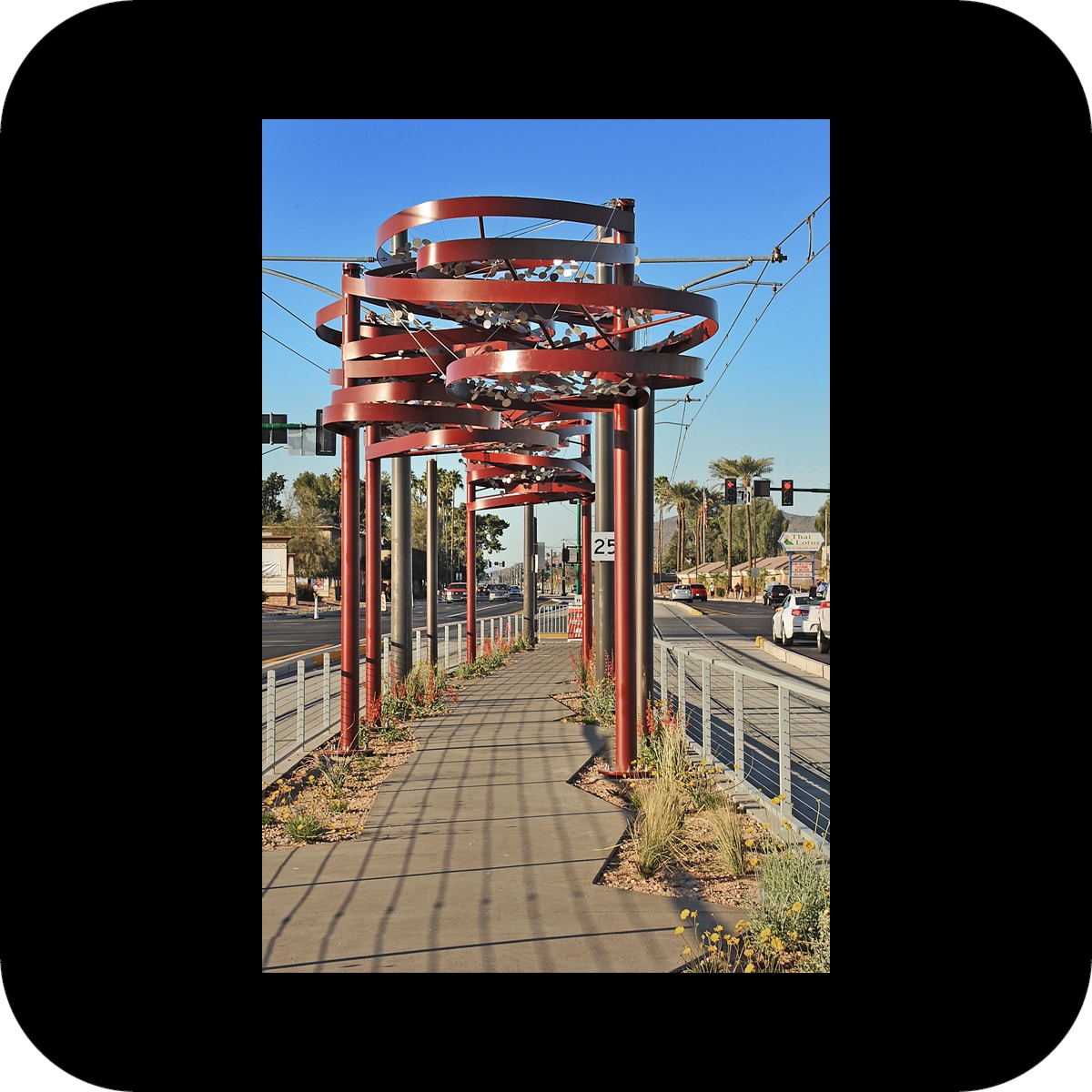
the glendale avenue light rail station is located in the middle of a busy multi-lane street and is accessible through a 180′ long pedestrian approach along the median.

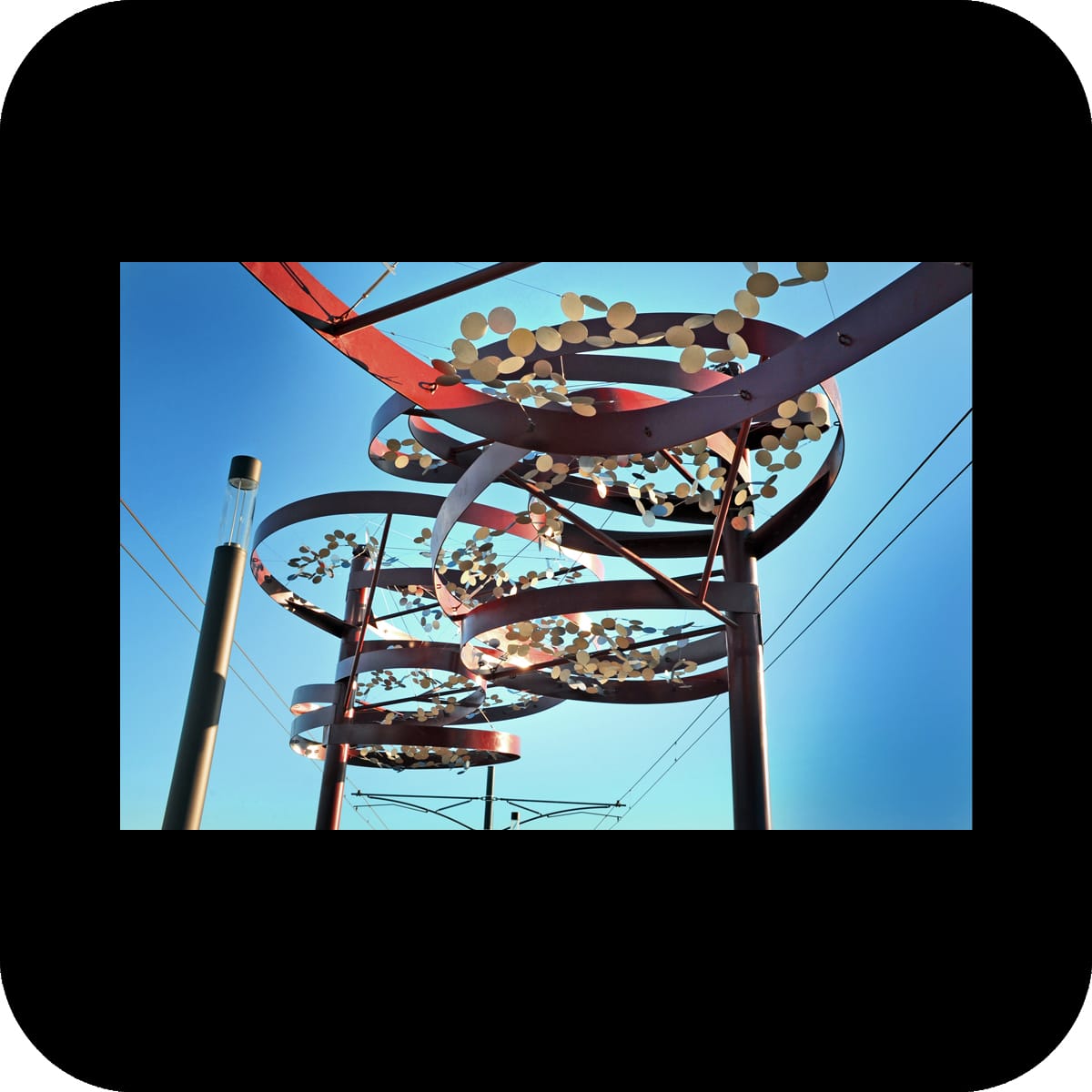
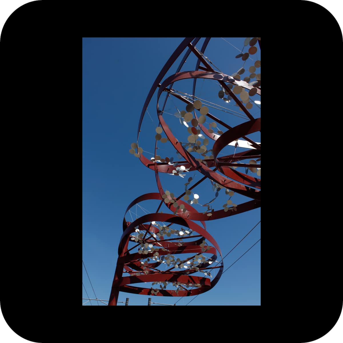
the art installation consists of five organically shaped canopies lining the walkway to the station, and was inspired by the origins of the name arizona: the basque words “aritz ona” mean “the good oak tree”.

our art “trees” add rhythm, shade, and interest to the station approach, and serve as a landmark to passersby and light rail passengers alike. small, sequin-like elements fill the canopies; they sway lightly in the wind and cast both light dots and shadows on the ground.

re currents

re currents

permanent public art installation on the rawhide wash bridge, scottsdale road between williams drive and pinnacle peak road, scottsdale, arizona
client: scottsdale public art, city of scottsdale, arizona

material: painted carbon steel
size: five bent and twisted arches, 16’x25’x118’
structural engineer: structural grace
steel fabrication: magnum companies
roll forming: paramount roll forming
photos: sean deckert courtesy of scottsdale public art
rawhide wash is a major desert wash in the scottsdale area. rare but intense flash floods occasionally flooded scottsdale road and made it impassable. with the construction of the new bridge, this issue is now of the past.

the 185 feet long and 150 feet wide bridge is a simple concrete platform. neither the elevation nor the amount of traffic lanes change on the bridge. the wash bed is dry the majority of time. all these factors obscure the perception of a major waterway. in order to bring the presence of a waterway back into consciousness of passersby we created an undulating wave-like structure that spans over the 14 feet wide pedestrian, equestrian and bicycle path on the east side of the bridge. this wave-like structure is reminiscing of the front wave of a flash flood.

the structure consists of 5 steel ribbons that were rolled and twisted to arch from the southern portion of the bridge edge to the northern portion of the vehicle barrier. each ribbon takes on a slightly different shape.

different types of passersby have a different perception of the artwork according to their mode of travel: the majority of viewers of the artwork are motorized. to them, the piece stands out as a landmark and transforms with the viewer’s changing perspective: the structure appears dynamic, since the front and back layers of the different shaped ribbons creates a moiré effect when viewed in passing. on the other hand, the public art piece enhances the pedestrian and bicyclist experience by creating a more sheltered and interesting space: they move through a multi-dimensional space created by the arches above and their shadows on the ground.

sky

sky

permanent light installation for the san francisco international airport, terminal 3, boarding area e, san francisco, ca
light programming in collaboration with morgan barnard
client: sfo, commissioned by the san francisco arts commission

materials: mirror-polished stainless steel, led lights, mineral paint
size: 27 spheres, dia. 2’ – 5’
structural engineer: brad w. smith
fabrication: weltkugelmanufaktur
installation: atthowe fine art services
photos: san francisco art commission, merge
‘sky’ is a suspended light sculpture composed of 27 mirror-polished stainless steel spheres, ranging in diameters from 2 to 5 feet. the globes are hollow with circular openings facing various directions. illumination levels in the interior of each globe change slowly and give the illusion of an expanding and flattening space: it becomes indiscernible whether one looks at a surface or into an opening. the color shades, created both by the painted interior and the lighting components, are representative of various sky colors.

the installation explores the human perception of space. the exterior of the mirrored spheres use reflections to camouflage themselves in their surroundings; they reflect their environment, and distort and reproduce it in miniature. the optical effect caused by the color and light changes in the interior causes the viewer to lose a sense of the spheres’ proportions as objects. the space becomes unreadable – opening and closing at the same time.

sodo

sodo

permanent public art installation at the spokane street viaduct in sodo, seattle, wa
client: seattle office of arts & cultural affairs

material: mineral paint on concrete
size: ±300 columns, ±3’x3’x22’
paint: keim mineral coatings
painting contractor: seattle painting specialists
stencil fabrication: pure black inc
photos: spike mafford, merge
sodo is a large-scale paint application on about 300 columns that hold up the spokane street viaduct. our goal was to enliven the whole space underneath the viaduct and to create a rhythm of eight distinct identifiable zones within the large space. the installation as a whole creates an identifying marker for sodo within the city of seattle.

in the last 200 years sodo has experienced a dramatic transformation from tidal flats to industrial area to a center of warehousing, packaging and distribution of goods. in our artwork we are using the over-arching image of barcodes to “label” the many layers that constitute sodo’s history. the use of barcodes points to sodo’s present reality, while the information encoded in the barcodes refers to a much deeper identity hidden beneath the surface: rather than just naming a product, the encoded words evoke stories / history related to the site.

graphically, the barcodes serve as the medium that weaves together the several layers of the site’s identity into one narrative. in addition to the barcodes, each of the stories is represented in an image/ product, condensed into a simple icon. these icons are used to create patterns that visually interact with the barcodes. a simple text layer is added to loosely hint at the stories behind the patterns.

sodo was part of the public art’s network (pan) 2013 year in review at the americans for the arts conference. the pan year in review annually recognizes outstanding public art projects that represent the most compelling works created in the prior year in the united states.

it leaves

it leaves

linear mural at rowan dozier layover bus station, east los angeles, ca
client: civic art program, los angeles county arts commission

materials: paint
size: 450’ x 7’
painting contractor: calco painting
stencils: pure black inc
photos: larry hirshowitz, merge

I have walked through many lives,
 some of them my own.
(STANLEY KUNITZ)

Here is what I have and what I owe, 
please listen to the count, the story and the sound.
(PABLO NERUDA)

no doubt the next chapter in my book of transformations is already written.
I am not done with my changes.
(STANLEY KUNITZ)

the creation of the large-scale mural was part of a remodel of a layover bus station in east los angeles. three concrete masonry walls, each 150 feet long, define the perimeter of the station. over time, these walls are being overtaken by deciduous vines, transforming the walls into a backdrop for nature’s play of growth, seasonal change and renewal.

the artwork plays with the notion of obscuring and revealing. painted patterns and text fragments were arranged in several layers to create a lace-like appearance and add a light, transparent quality to the walls. the patterns were derived from the leaf, flower and fruit shapes of the plants in front of the wall. each pattern appears on the wall in direct vicinity to the plant it was developed from. the patterns playfully interact with each other as well as with their natural counterpart and vary between denser, more detailed areas to more open, loose arrangements.

additionally, fragments from two poems are integrated into the patterns – one from pablo neruda’s book “the sea and the bells”, the other one from stanley kunitz’s poem “the layers”. both poems describe life and its meandering ways in face of an ever-changing nature that, compared to our daily lives, seems to follow its own rhythm.

as nature has slowly overtaken the walls, a transformation has been reached: the words of the poets are hidden, to be rediscovered in the next seasonal cycle of nature.

ooo

ooo

color and graphic scheme for allen j. martin park, la puente, ca
client: civic art program, los angeles county arts commission

materials: paint, stencils
painting contractor: calco painting
stencils: pure black inc
photos: merge
this project was done as part of a bigger renovation of allen martin park in los angeles county. we were asked to create a simple color concept. our goal was to create a unique identity for this site that reflects its recreational use while involving the community into the process.

circles form the main motif of our application. the circle conveys a strong meaning beyond cultural barriers – it represents wholeness and unity, and is generally a symbol of life. on a different level circles can evoke playfulness through associations like balloons, bubbles or balls.

background application / canvas:
a random and simple pattern of circles was applied in a variety of densities throughout the park, unifying a number of different elements of architecture and landscape. The circles were painted in bright colors (orange, pink, blue and two greens) that visually interact with each other. the community embraced our effort introducing strong colors to the site, which was formerly characterized by beige and brown hues.

community participation:
after the base layout of the circles was applied we invited the community to attend a workshop about colors: we explored the history, meaning and symbolism of specific colors. we consequently produced stencils that represented objects associated with a specific color (i.e. a basketball for the color orange). on the following “color day” the community was invited to use the provided stencils to paint with various shades and tints of the appropriate color on any circle that matched their color. by receiving information combined with hands-on work with colors participants acquired a deeper understanding and appreciation for colors and art. the participation project was fun and educational for both us and the public, and increased the community’s identification with the site.

the project has significantly reduced the graffiti problem at the park. smaller circular stencils are being used by the park staff for continuous graffiti management when necessary. the circular pattern thus intensifies over time.

the success of this project has inspired la county to include artists in many more of their facilities renovation projects.

overcoat

overcoat

color concept and tile artwork for usc medical center (t47) and california state university los angeles (t48) bus-way stations, los angeles, ca
client: los angeles county metropolitan transportation authority

materials: paint, ceramic tile
tile fabrication: heath ceramics
tile meshing: precision h2o
photos: courtesy of Metro © 2006 LACMTA, merge
the challenge at both bus-way stations was to convert unappealing, utilitarian structures next to a freeway into more attractive environments through new color schemes and tile applications.

at the usc medical center’s bus-way station, the choice of two green and three blue tints counteracts the gray color palette of the immediate surroundings (the interstate 10 freeway and the adjacent railway). the 1970s’ station with a stern atmosphere became transformed into a playful array of color spaces.

the tile application in the station repeats the colors of the paint scheme and forms mosaics of several graphic icons. the icon subjects were derived from the surrounding area of the station as well as the destinations of the bus lines.

at the second bus-way station at cal state la, tints of reds were used to brighten up the station. the basis of the paint scheme for this station was the observation of an ever occurring problem at the site: graffiti. instead of trying to paint over graffiti with a color that is supposed to (but never really does) match the under-laying color, the maintenance staff was provided with rectangular stencils to paint over the graffiti with four distinct red tints. this process of over-coating will create an intentional, random pattern over time that directly reacts to the urban phenomenon of graffiti. it makes the dynamic of tagging and over-coating part of the artwork. additionally, tile applications in two areas of this station work graphically with a similar color palette and rectilinear patterns.