room within

room within

public art enhancements for the vta santa clara – alum rock bus rapid transit project, san jose, ca
client: valley transportation authority (vta) in conjunction with the san jose public art program

pattern concept development, community outreach and research in collaboration with corinne takara
various pattern designs in collaboration with jose pimienta
king street stations in collaboration with rick moreno
story street sb ceiling by raul delgado

materials: glass, painted aluminum, concrete w/ inlays
size: art treatment in 18 shelters, ±12×8’x8’

shelter architectsibi group
glass: triview industries
metal fabricator: magnum companies
concrete: concreteworks
photos: gary shatan, merge

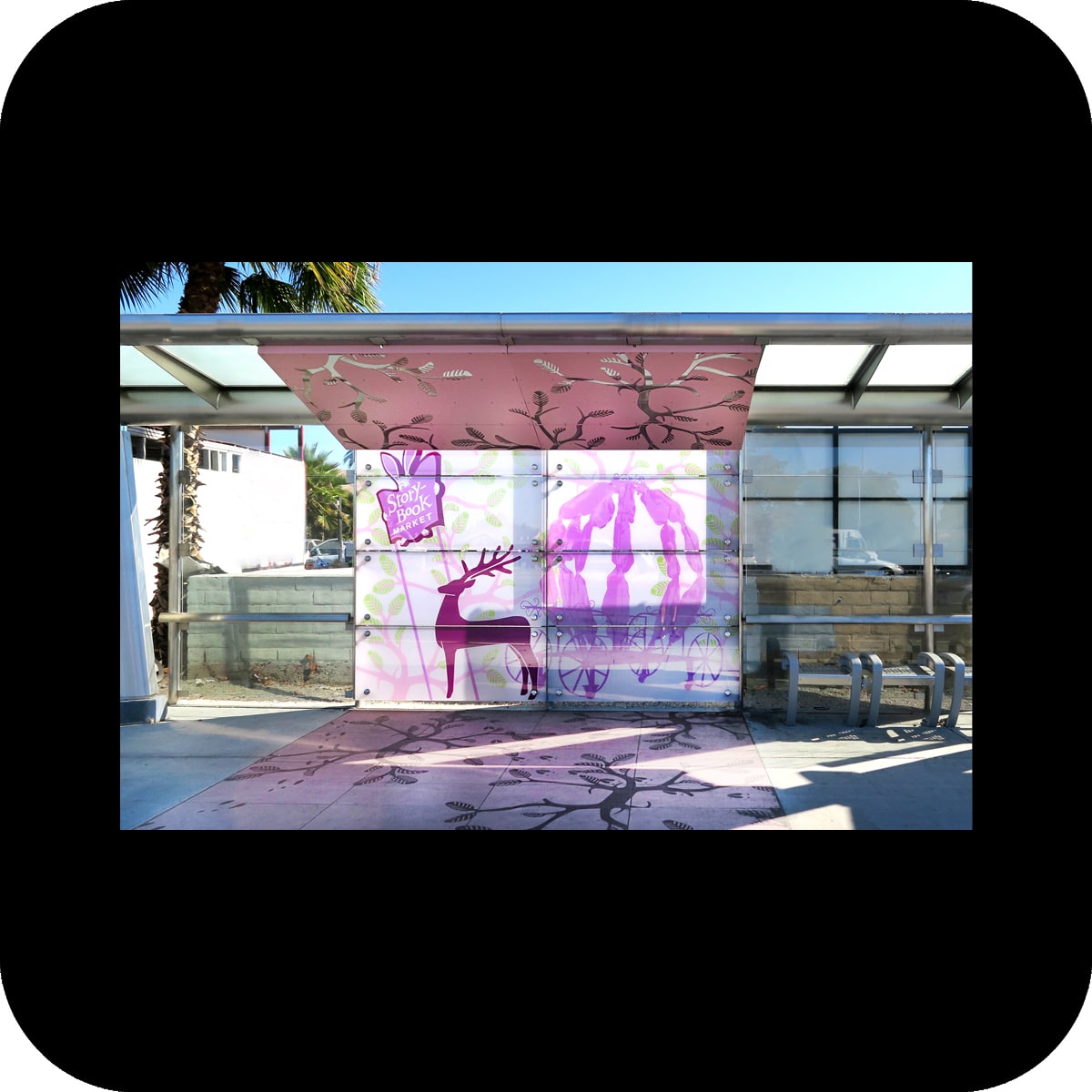
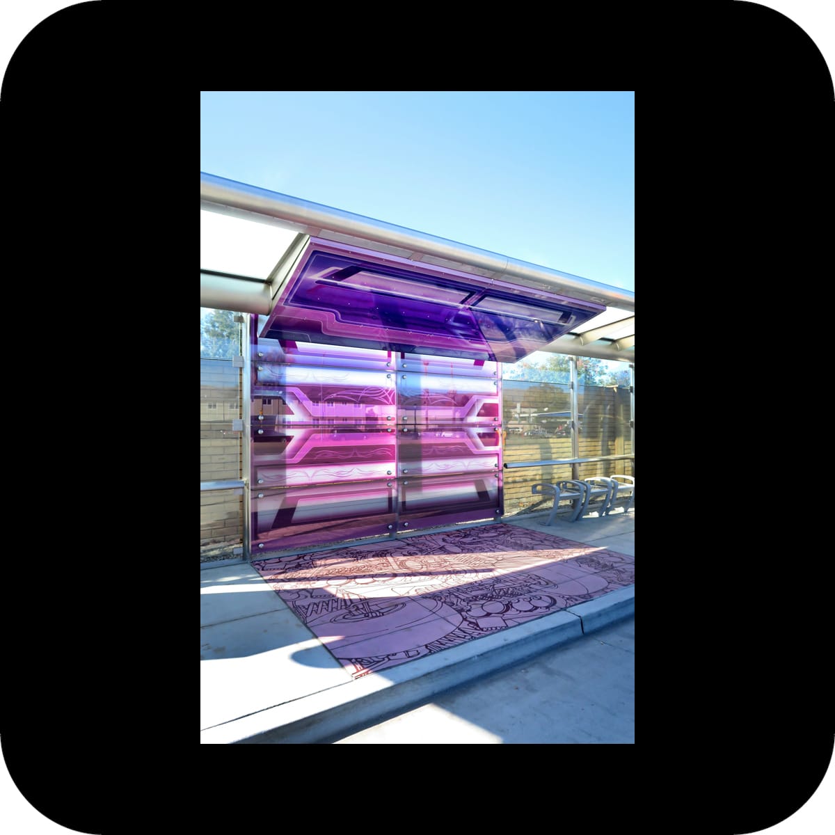
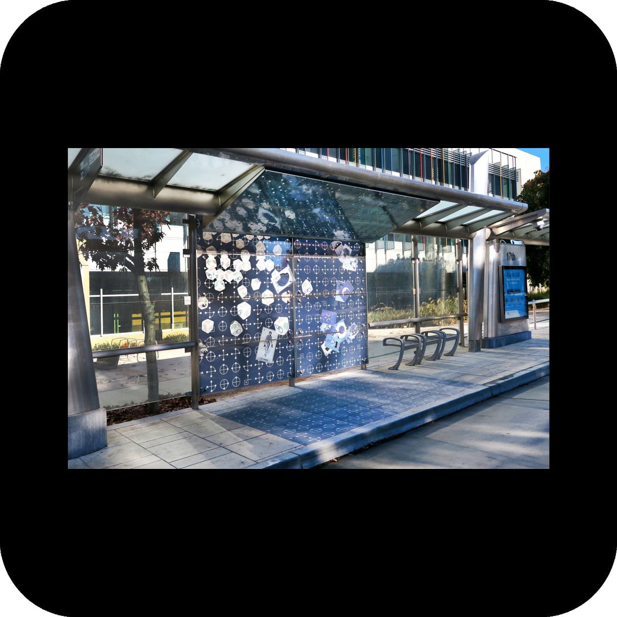
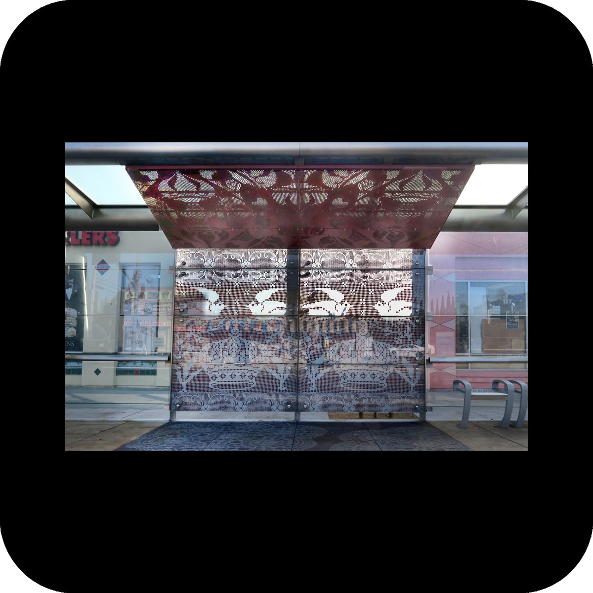
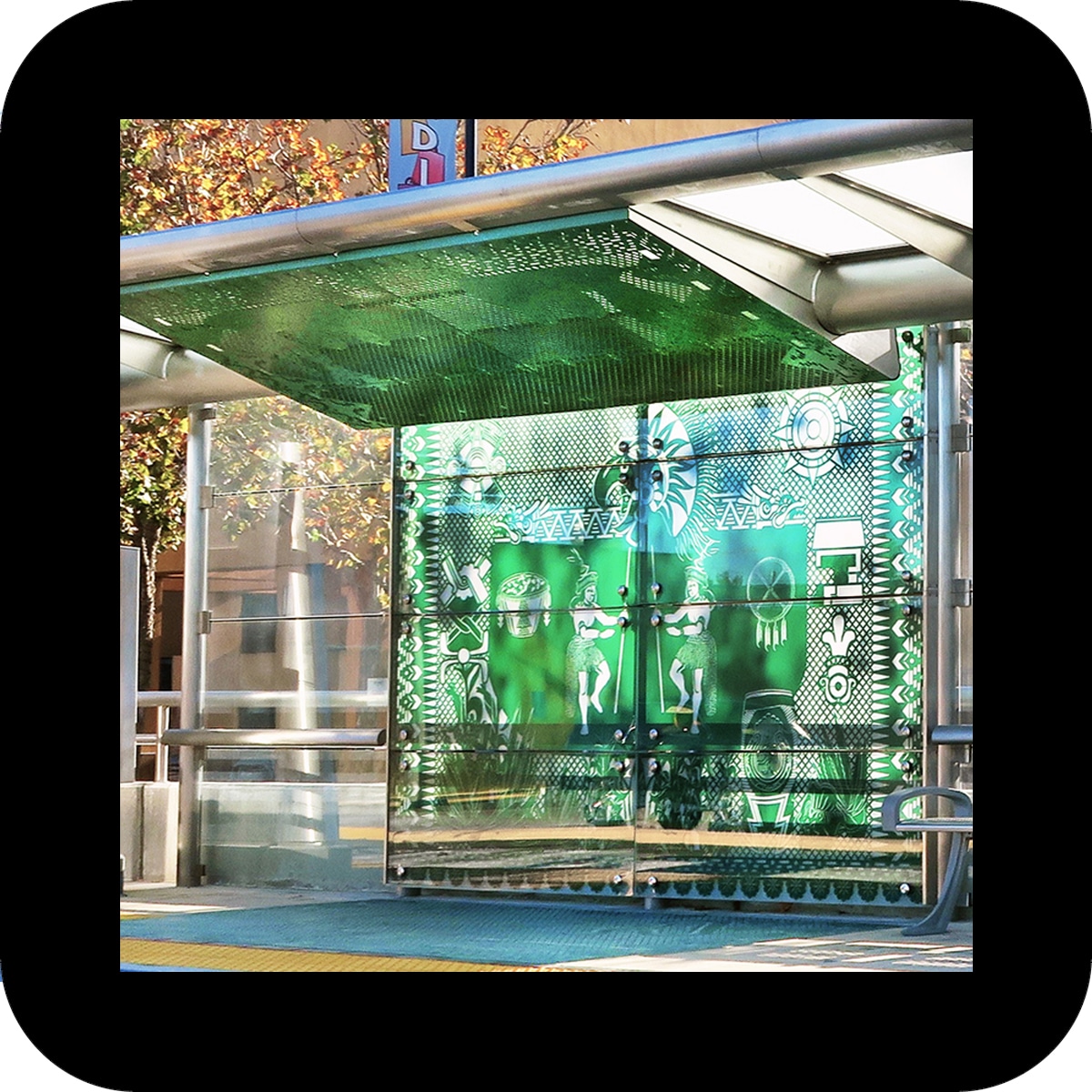
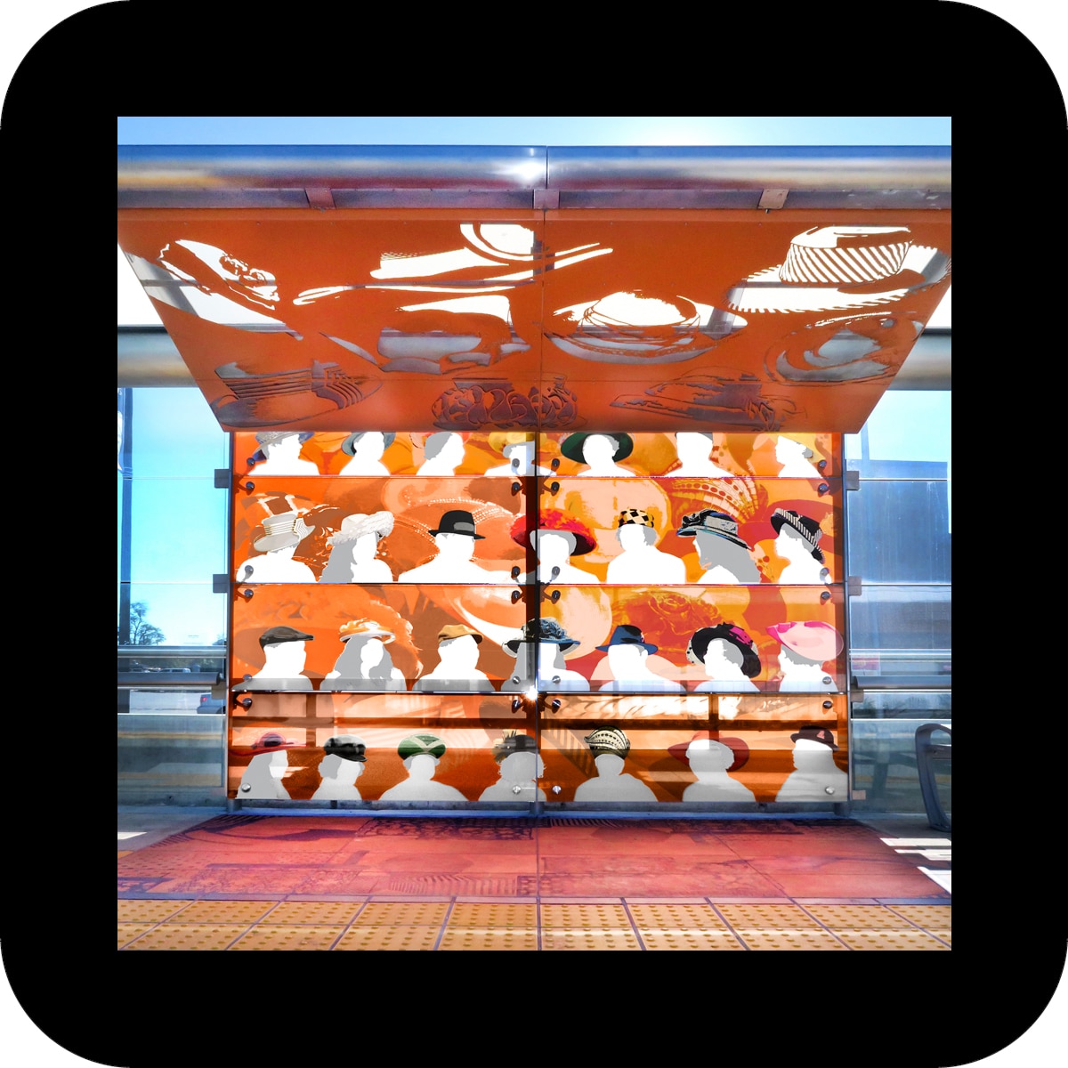
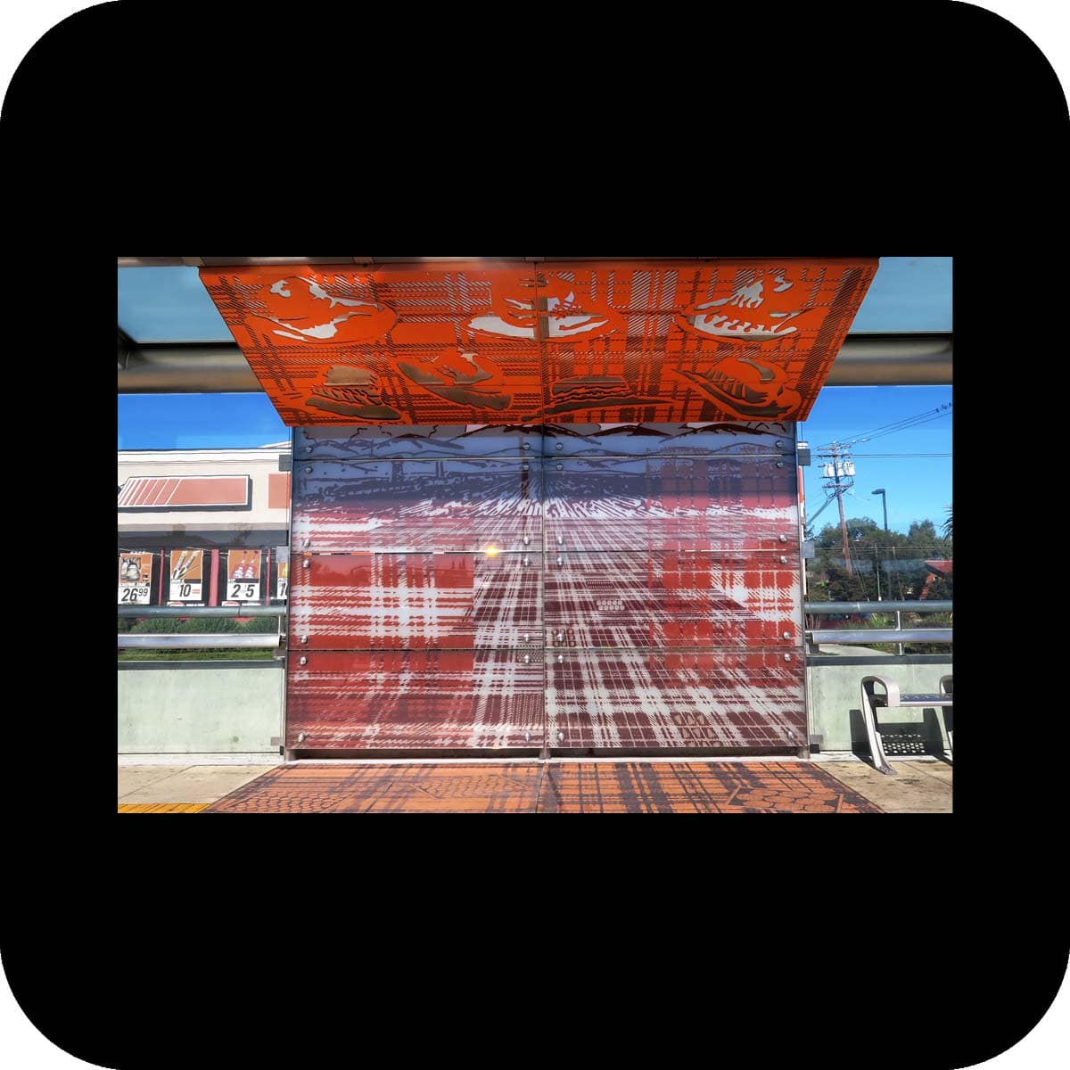
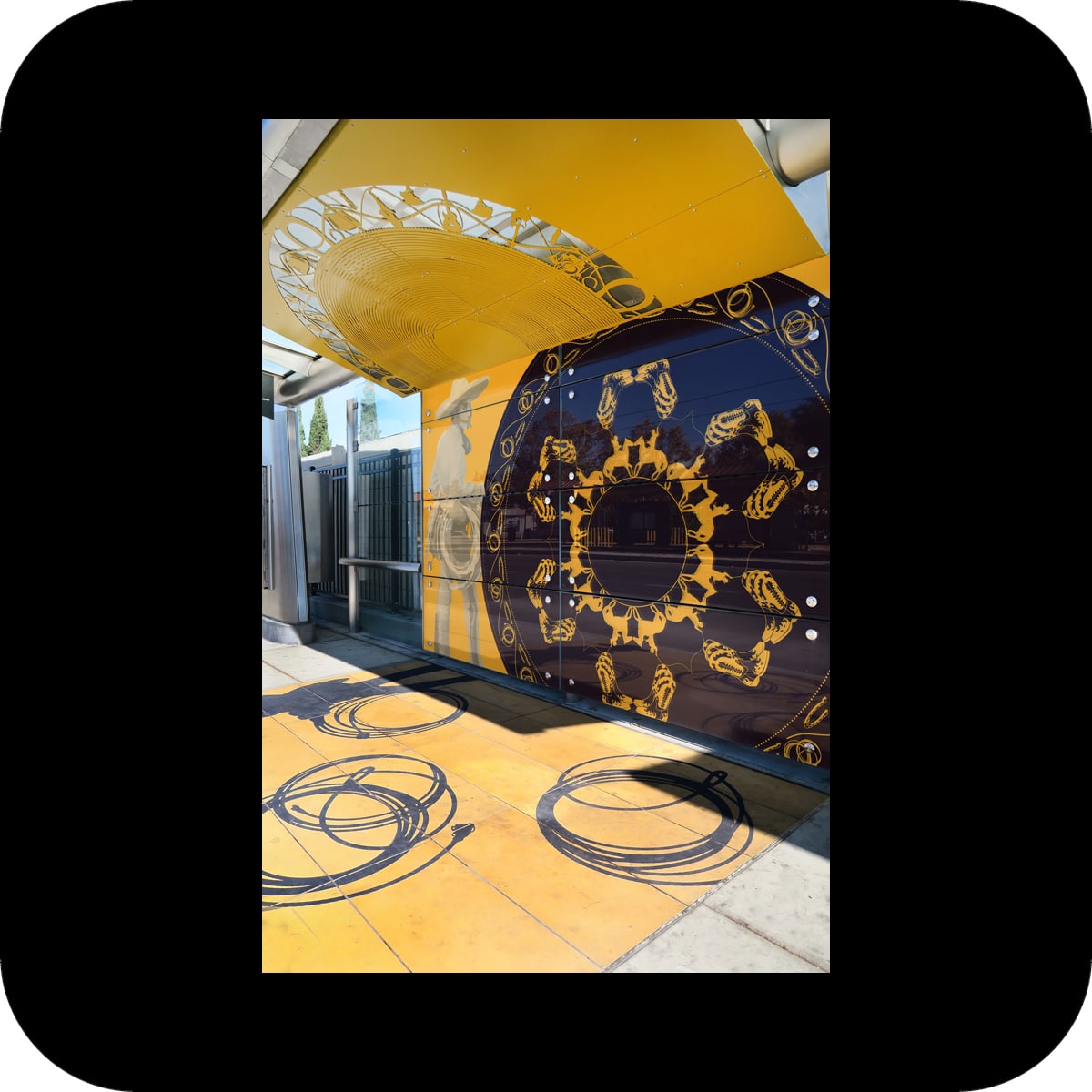
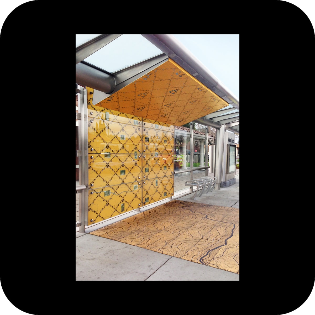
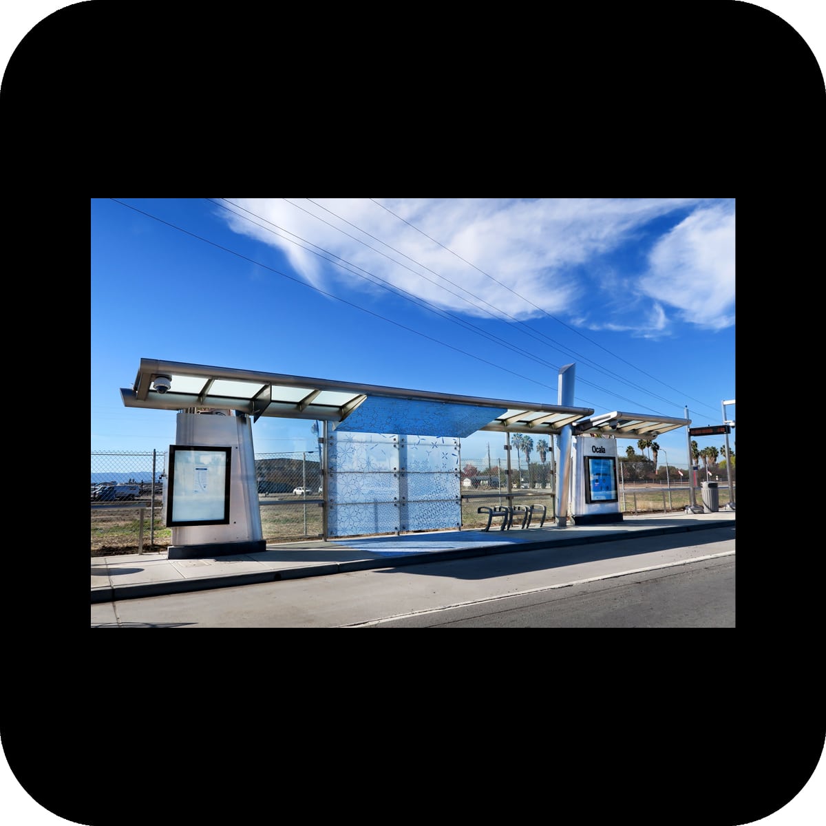
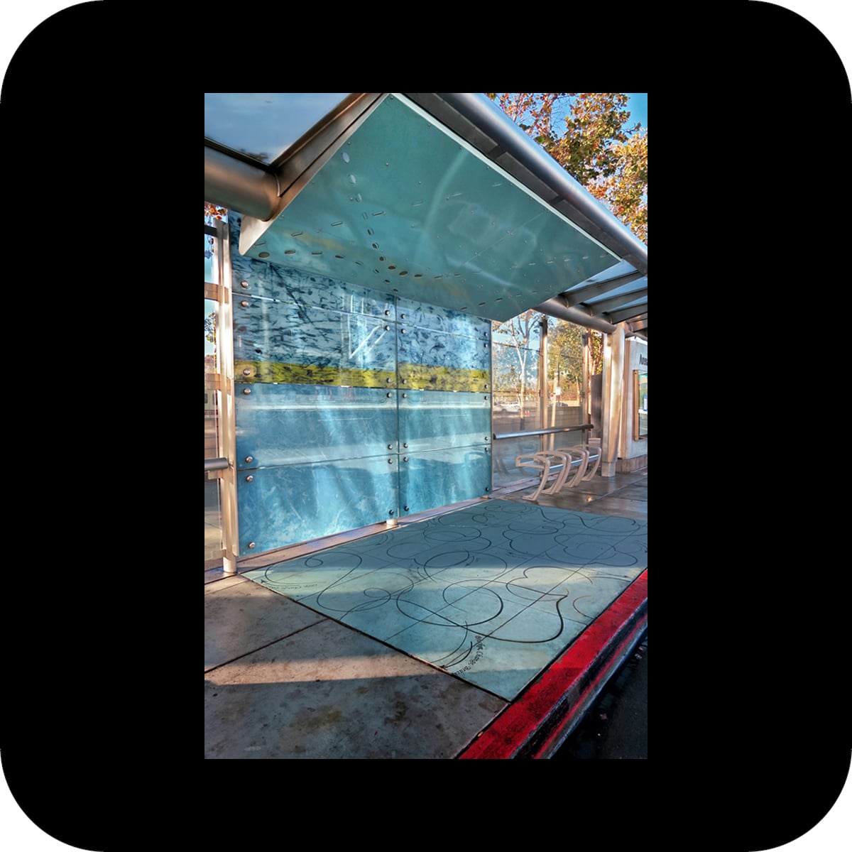
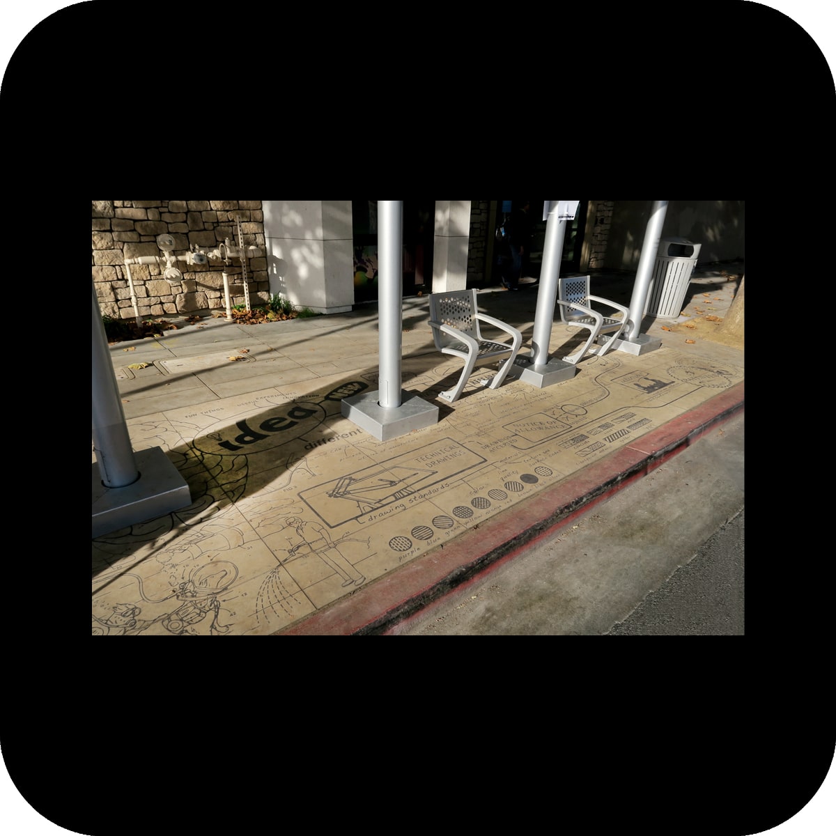
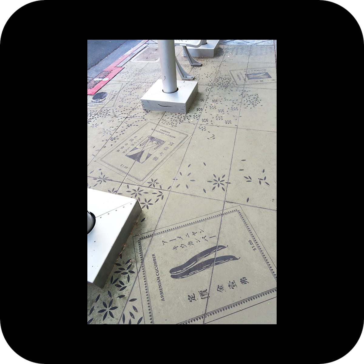
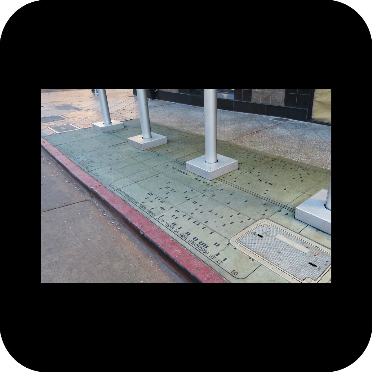
eighteen bus shelter along the santa clara-alum rock bus rapid transit line received art enhancements with the goal to reinforce a coherent identity of the transit line.

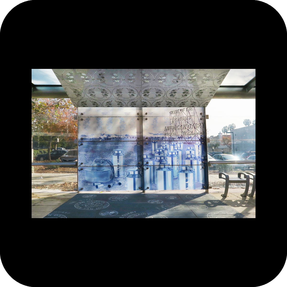
the art enhancements consist of three elements – a glass wind screen, metal ceiling panels, and concrete pavers that create a distinct space within each shelter. while the details and materials of these treatments remain the same at each shelter, the patterns vary to give each shelter a unique identity. each station location i.e. north and southbound is defined by one specific color to further strengthen each station’s geographical identity on the transit line.

patterns were derived from stories and elements related to the surrounding neighborhood of each station: detailed research and intense community input helped to select topics that are sometimes historic, and other times contemporary in their reference.

for example, one of the 18 shelters derived its story from the ice arena located at close proximity to the shelter. motifs were created from a flying puck, marks left at the hockey rink after a san jose sharks game (traces on ice, puck marks on bounds), and traditional figure skating instructions.

another station derived its story from local dairies, formerly a prime industry in the area, and now mostly vanished. historic images of dairies and artifacts related to them informed these patterns.

eastbound

17th street
24th street
jackson avenue
alum rock avenue
ocala avenue

westbound

17th street
24th street
jackson avenue
alum rock avenue
ocala avenue

it leaves

it leaves

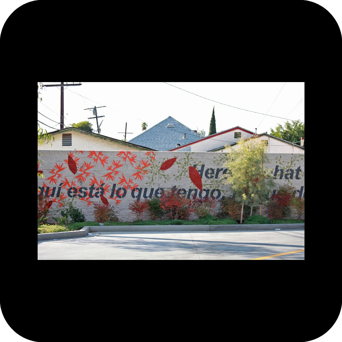
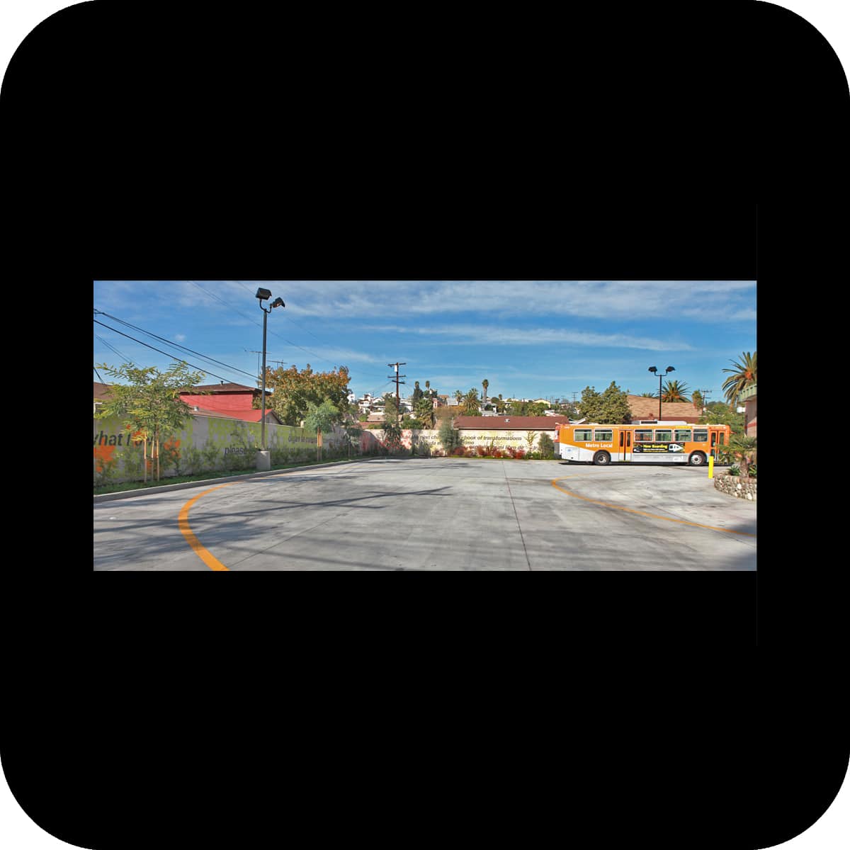
linear mural at rowan dozier layover bus station, east los angeles, ca
client: civic art program, los angeles county arts commission

materials: paint
size: 450’ x 7’
painting contractor: calco painting
stencils: pure black inc
photos: larry hirshowitz, merge

I have walked through many lives,
 some of them my own.
(STANLEY KUNITZ)

Here is what I have and what I owe, 
please listen to the count, the story and the sound.
(PABLO NERUDA)

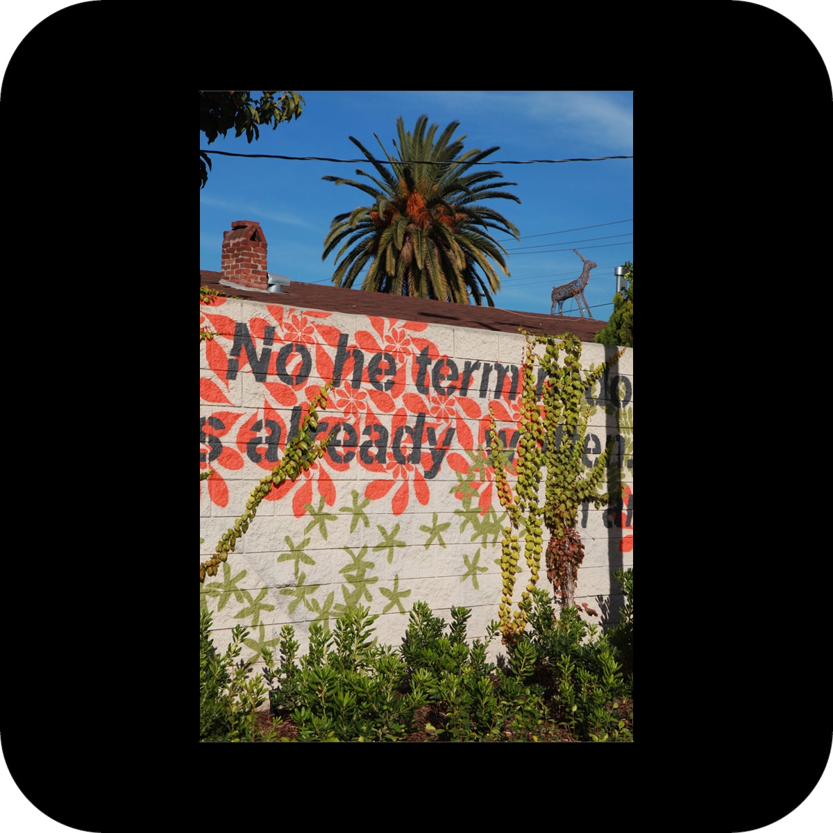
no doubt the next chapter in my book of transformations is already written.
I am not done with my changes.
(STANLEY KUNITZ)

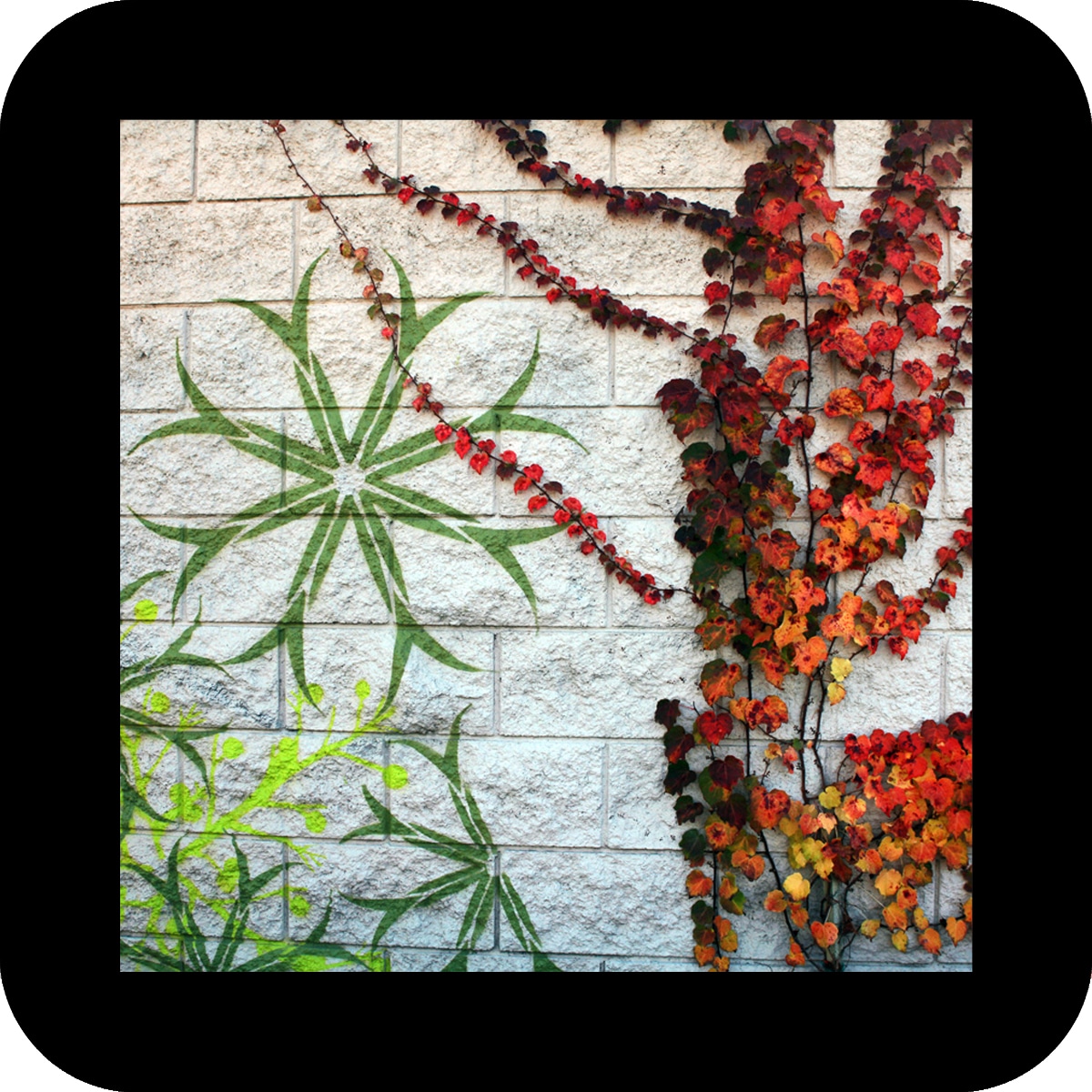
the creation of the large-scale mural was part of a remodel of a layover bus station in east los angeles. three concrete masonry walls, each 150 feet long, define the perimeter of the station. over time, these walls are being overtaken by deciduous vines, transforming the walls into a backdrop for nature’s play of growth, seasonal change and renewal.

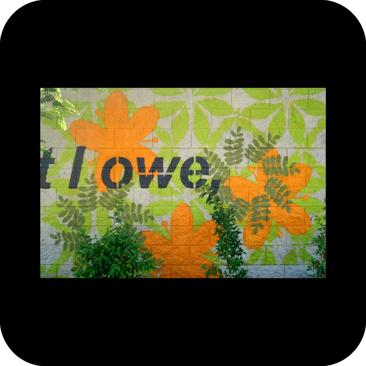
the artwork plays with the notion of obscuring and revealing. painted patterns and text fragments were arranged in several layers to create a lace-like appearance and add a light, transparent quality to the walls. the patterns were derived from the leaf, flower and fruit shapes of the plants in front of the wall. each pattern appears on the wall in direct vicinity to the plant it was developed from. the patterns playfully interact with each other as well as with their natural counterpart and vary between denser, more detailed areas to more open, loose arrangements.

additionally, fragments from two poems are integrated into the patterns – one from pablo neruda’s book “the sea and the bells”, the other one from stanley kunitz’s poem “the layers”. both poems describe life and its meandering ways in face of an ever-changing nature that, compared to our daily lives, seems to follow its own rhythm.

as nature has slowly overtaken the walls, a transformation has been reached: the words of the poets are hidden, to be rediscovered in the next seasonal cycle of nature.

overcoat

overcoat

color concept and tile artwork for usc medical center (t47) and california state university los angeles (t48) bus-way stations, los angeles, ca
client: los angeles county metropolitan transportation authority

materials: paint, ceramic tile
tile fabrication: heath ceramics
tile meshing: precision h2o
photos: courtesy of Metro © 2006 LACMTA, merge
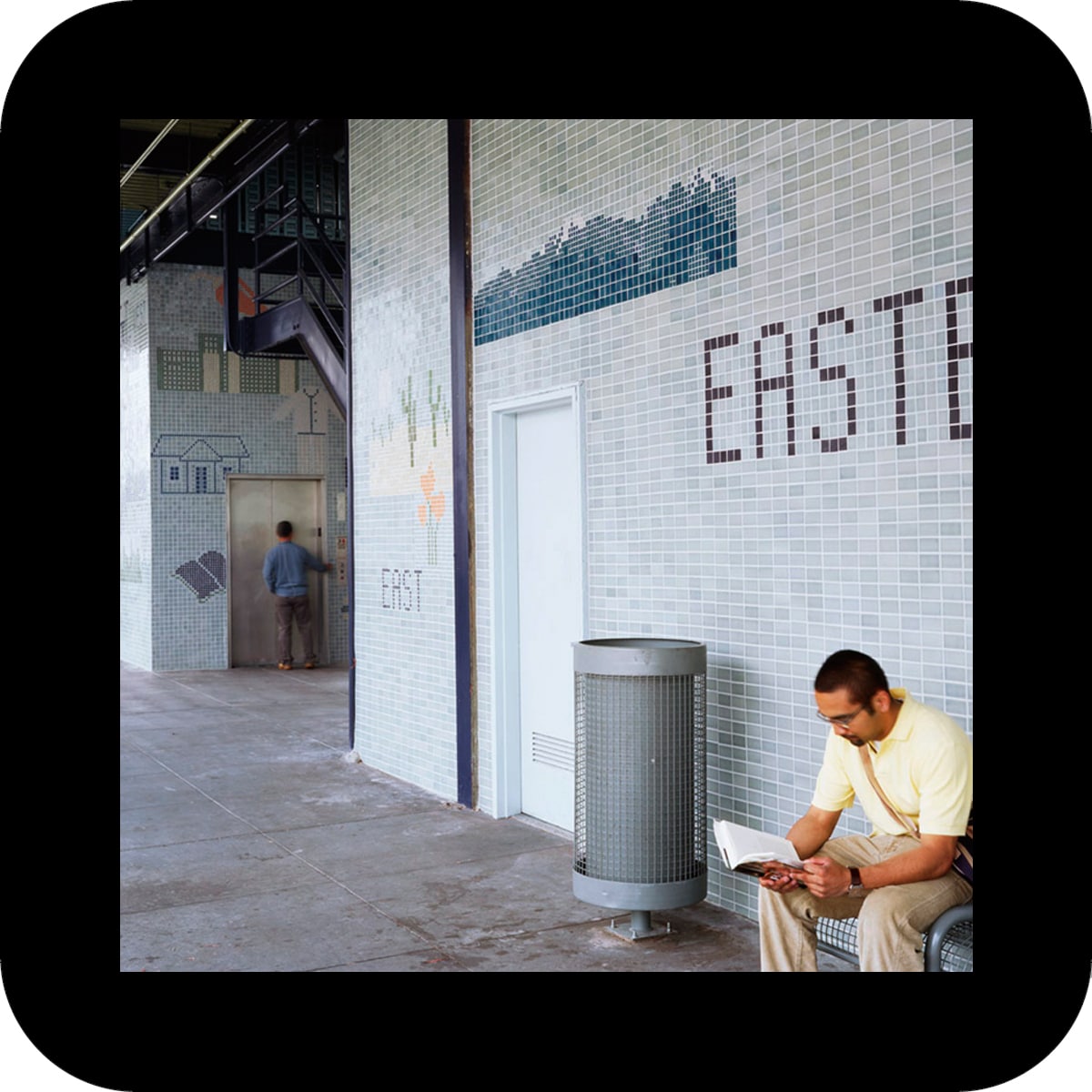
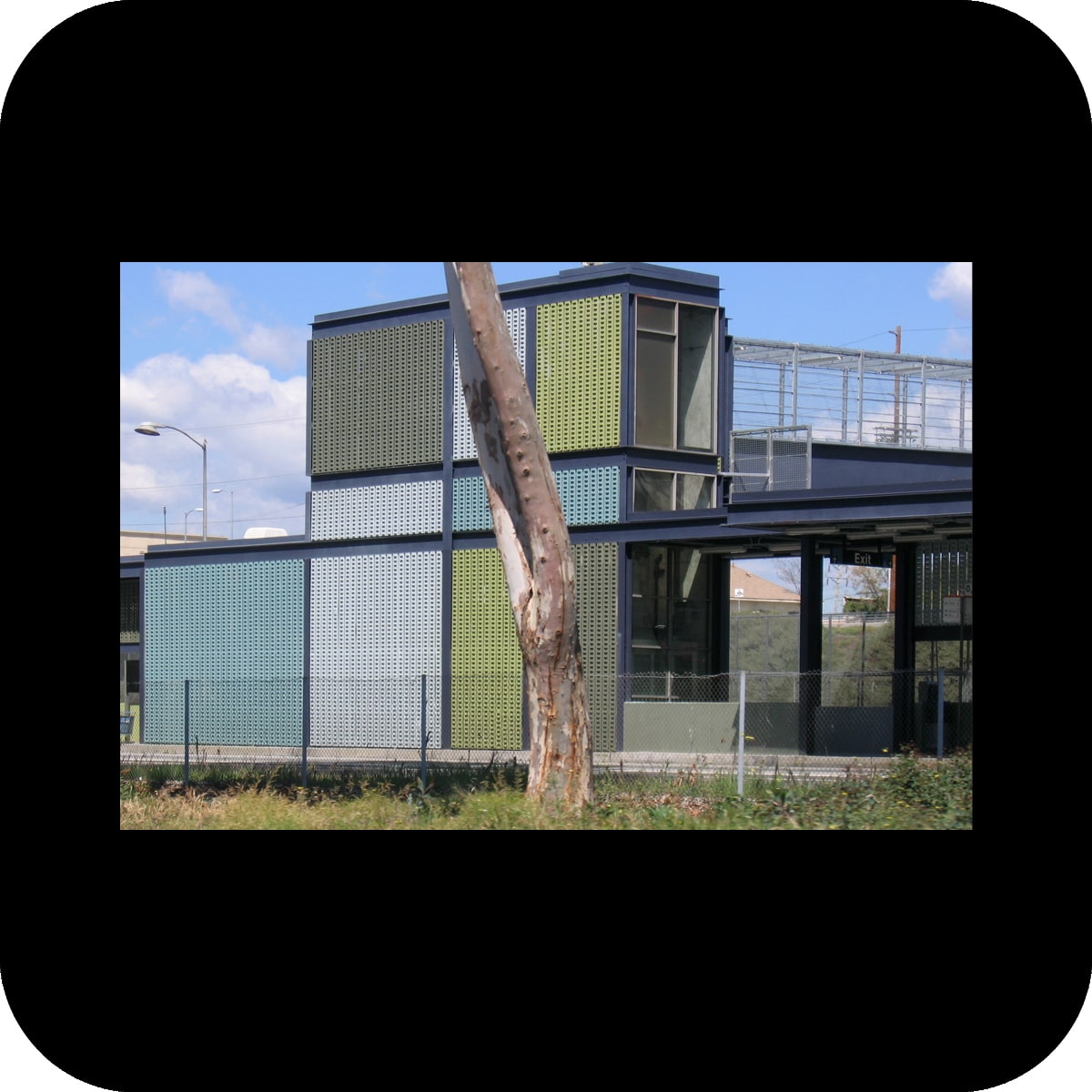
the challenge at both bus-way stations was to convert unappealing, utilitarian structures next to a freeway into more attractive environments through new color schemes and tile applications.
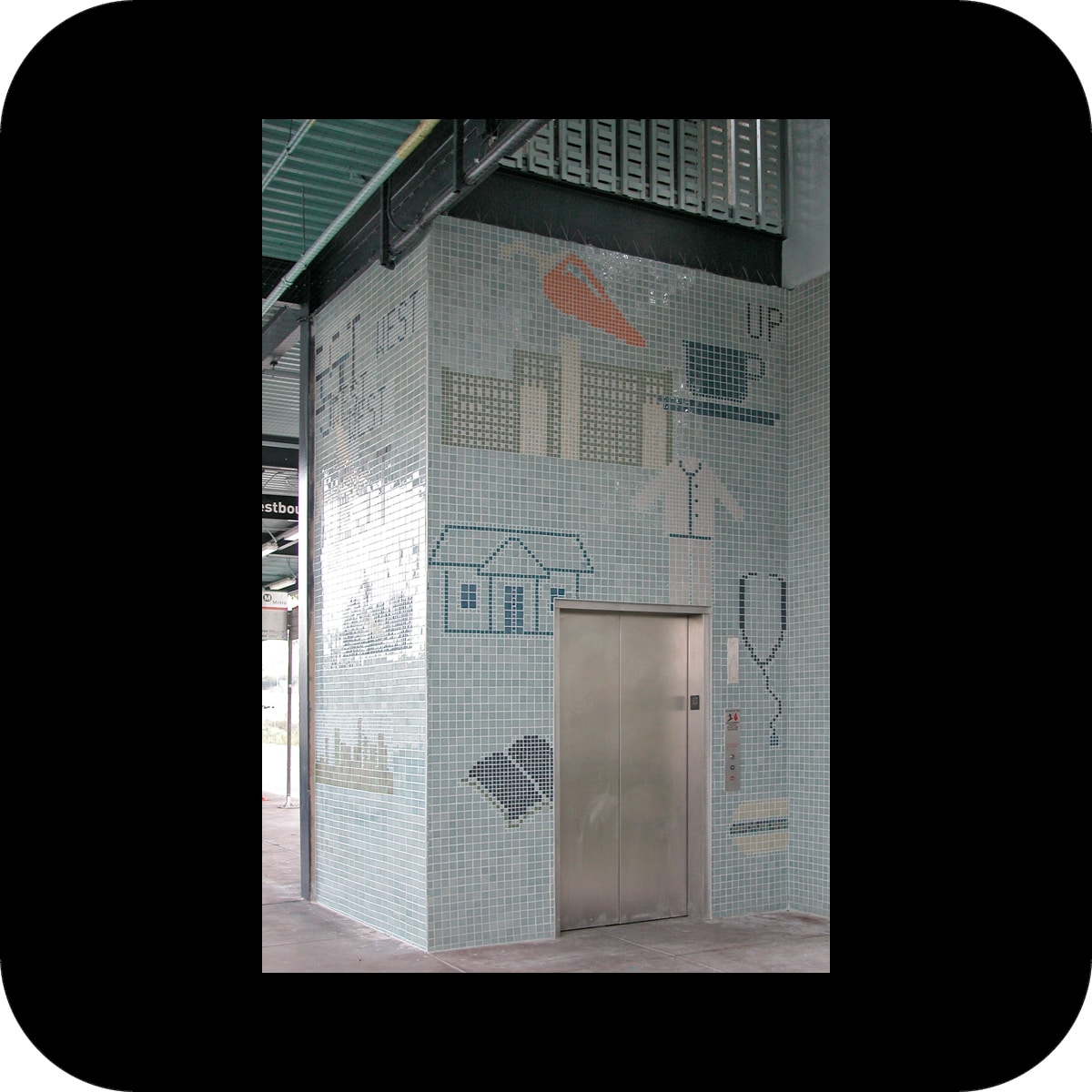
at the usc medical center’s bus-way station, the choice of two green and three blue tints counteracts the gray color palette of the immediate surroundings (the interstate 10 freeway and the adjacent railway). the 1970s’ station with a stern atmosphere became transformed into a playful array of color spaces.
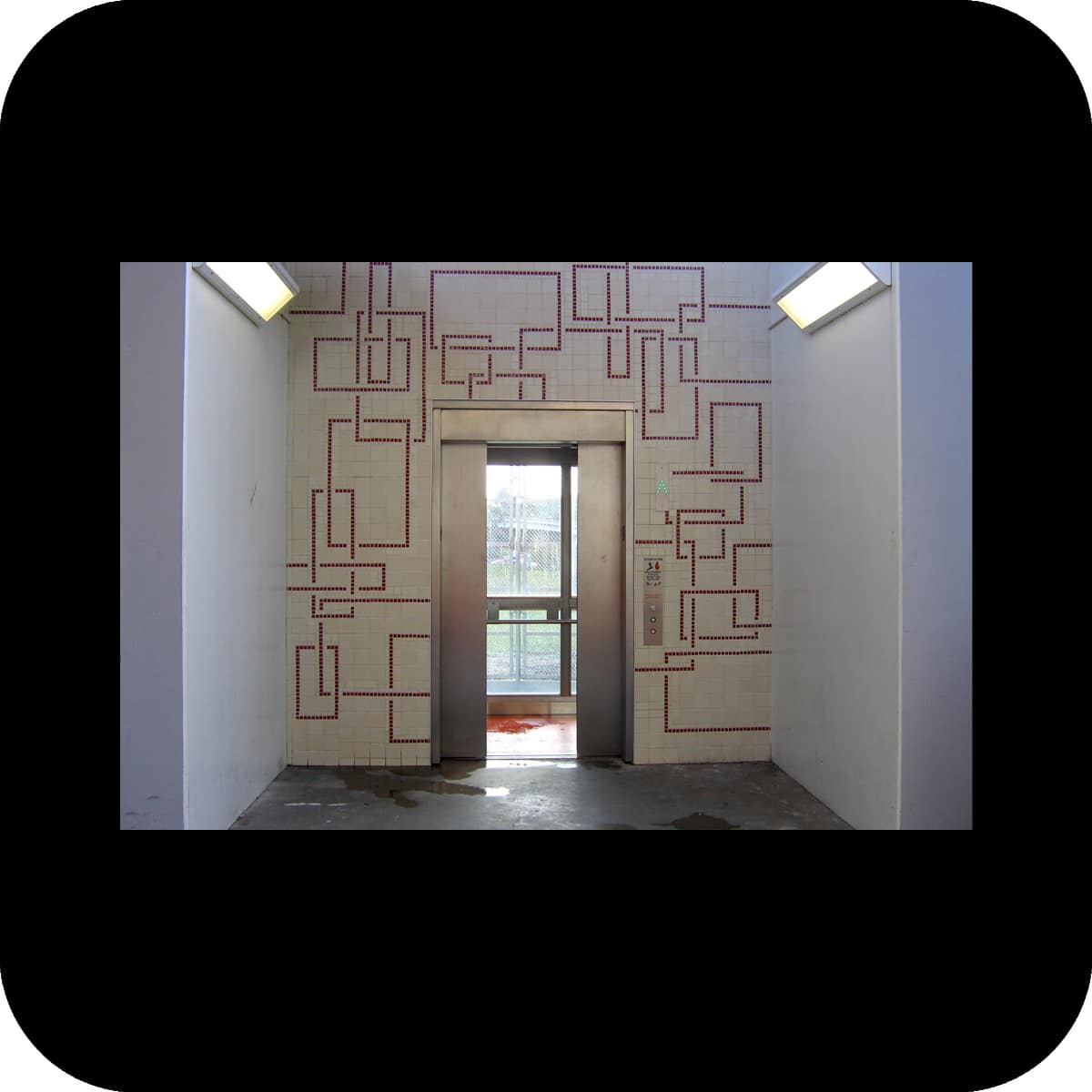
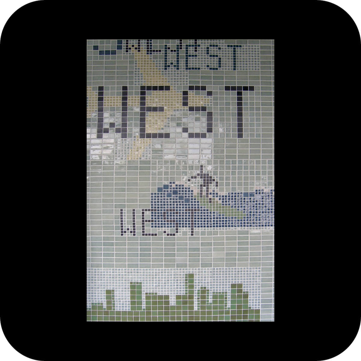
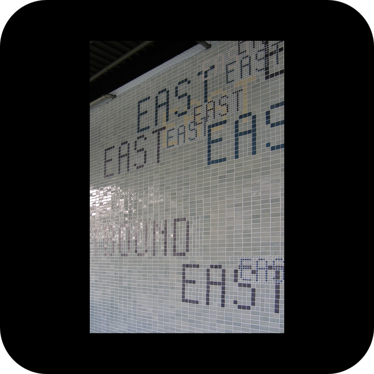
the tile application in the station repeats the colors of the paint scheme and forms mosaics of several graphic icons. the icon subjects were derived from the surrounding area of the station as well as the destinations of the bus lines.
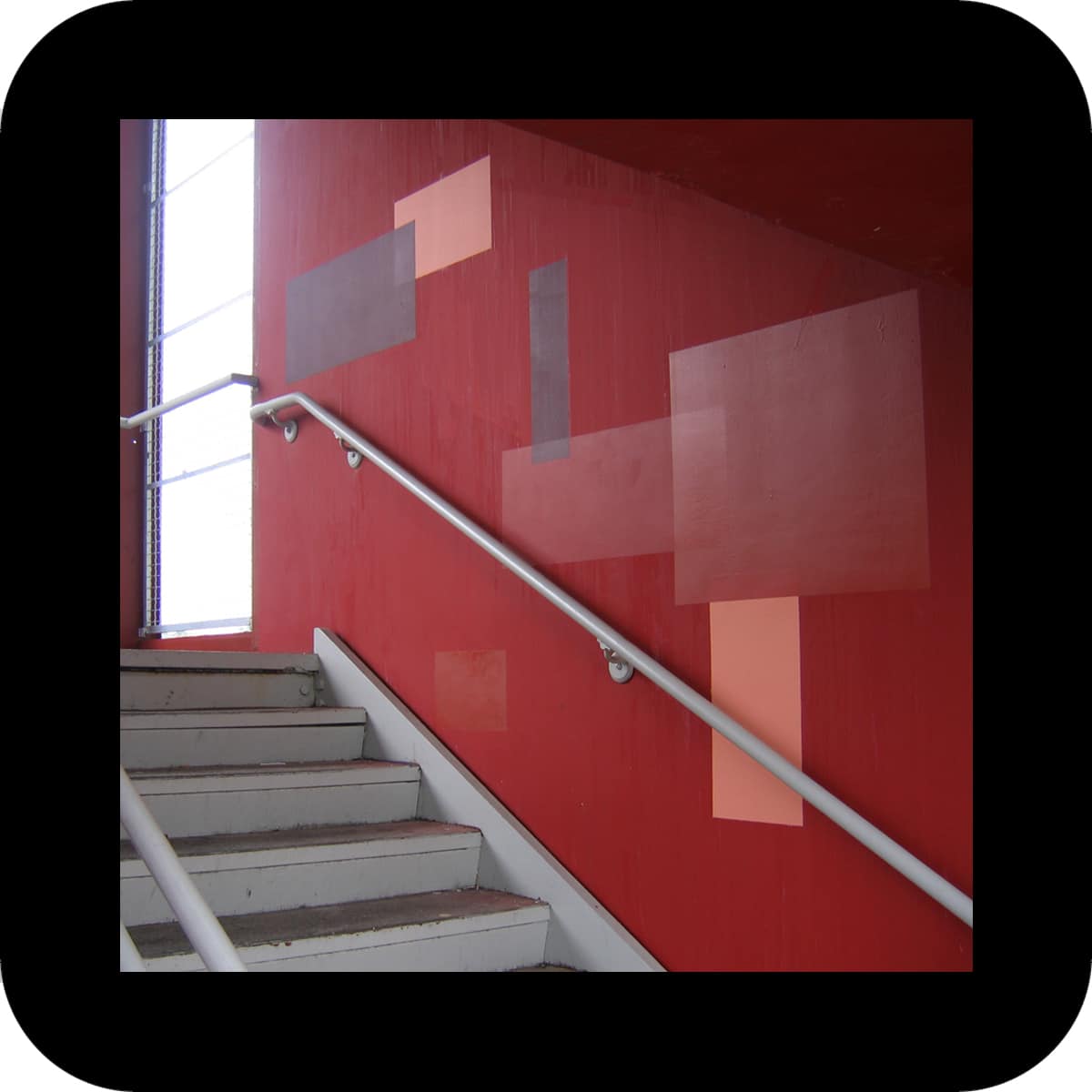
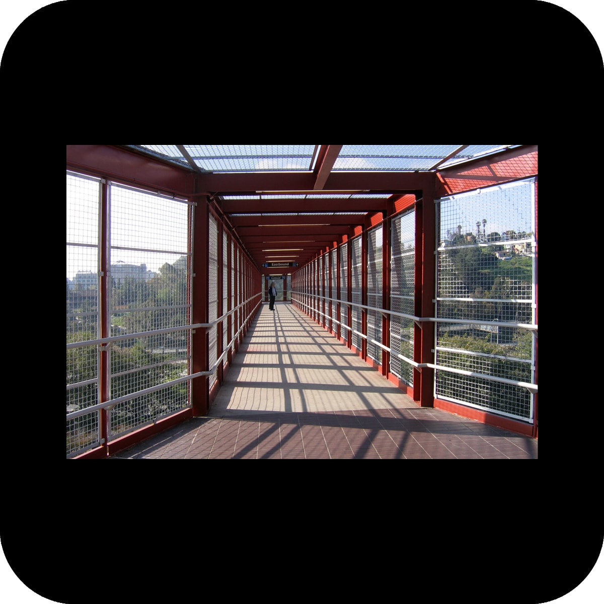
at the second bus-way station at cal state la, tints of reds were used to brighten up the station. the basis of the paint scheme for this station was the observation of an ever occurring problem at the site: graffiti. instead of trying to paint over graffiti with a color that is supposed to (but never really does) match the under-laying color, the maintenance staff was provided with rectangular stencils to paint over the graffiti with four distinct red tints. this process of over-coating will create an intentional, random pattern over time that directly reacts to the urban phenomenon of graffiti. it makes the dynamic of tagging and over-coating part of the artwork. additionally, tile applications in two areas of this station work graphically with a similar color palette and rectilinear patterns.